Project notes: Coronado
written by jeres
Let's start with the fact that I kinda love when things are a little fucked up.
If things are too perfect, you can't trust them. You know you're missing something if you wouldn't change a thing. If something, however, shows its imperfections... it feels more honest or real, and maybe that flaw doesn't need to be fixed at all.
Time will pass, things will age (and show it) and elements that might not initially be considered ideal may become the things we appreciate and adore the most. We could apply this to people or relationships (or a lot of things that may seem more consequential), but for now, I'd rather talk about my guitar and why I love it in spite of there being so many things wrong with it.
Don't worry, I'll talk about the art eventually. Bear with me.
The guitar is a 1967 Fender Coronado II and I got it on eBay in the early 2000s for basically nothing because of its condition. I've since had a ~20 year relationship with it, and while I have no idea who or what beat the shit out of it to make it what it is now, I am grateful for their work & mis-care. Plug it into a tube amp with spring reverb from the same era and you have something uniquely enchanting, at least, to me.
It has a replaced pickup that adds a throat-y grit and Bigsby vibrato that feels like a misguided afterthought. It weighs almost nothing because it has no sustain block, which also guarantees screaming feedback if its pointed anywhere near the amp it's plugged into. It was marvelous noise to me, a howl, and was relatively consistent if you knew how to coax out what you were looking for. It was never quite the same, to be clear, but that was the endearing part. It had a personality that was specific, finicky and satisfying once you built a relationship with it and understood its point of view. In some ways, it played you.
And just behold it, it looks like trash. Beautiful, wonderful, vintage trash. I don't know if a former owner left it in the sun, stored it underwater, had acidic sweat that reacted with the finish or what, but to me, it was gorgeous.
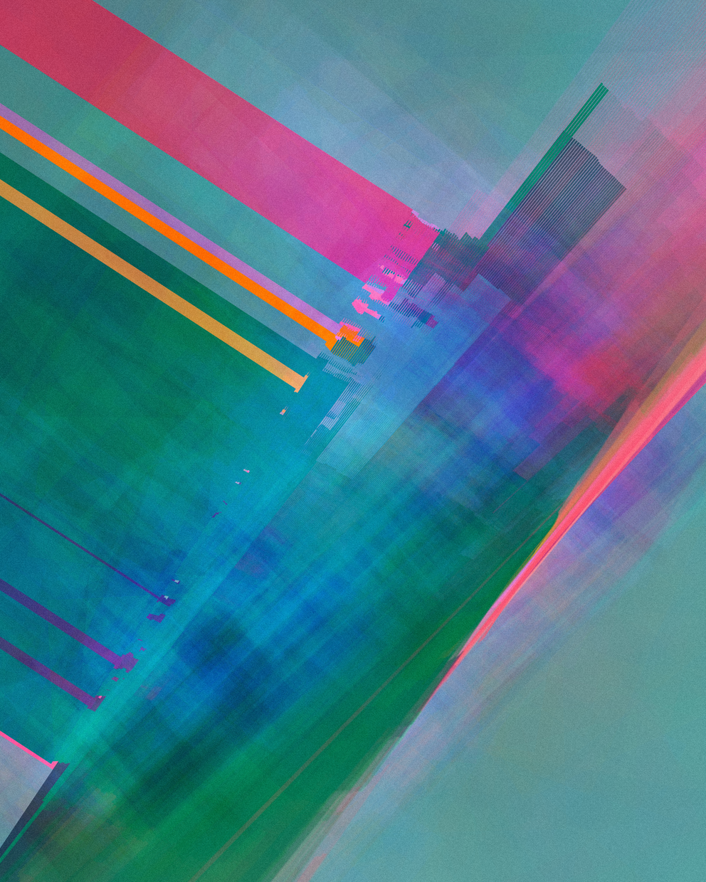
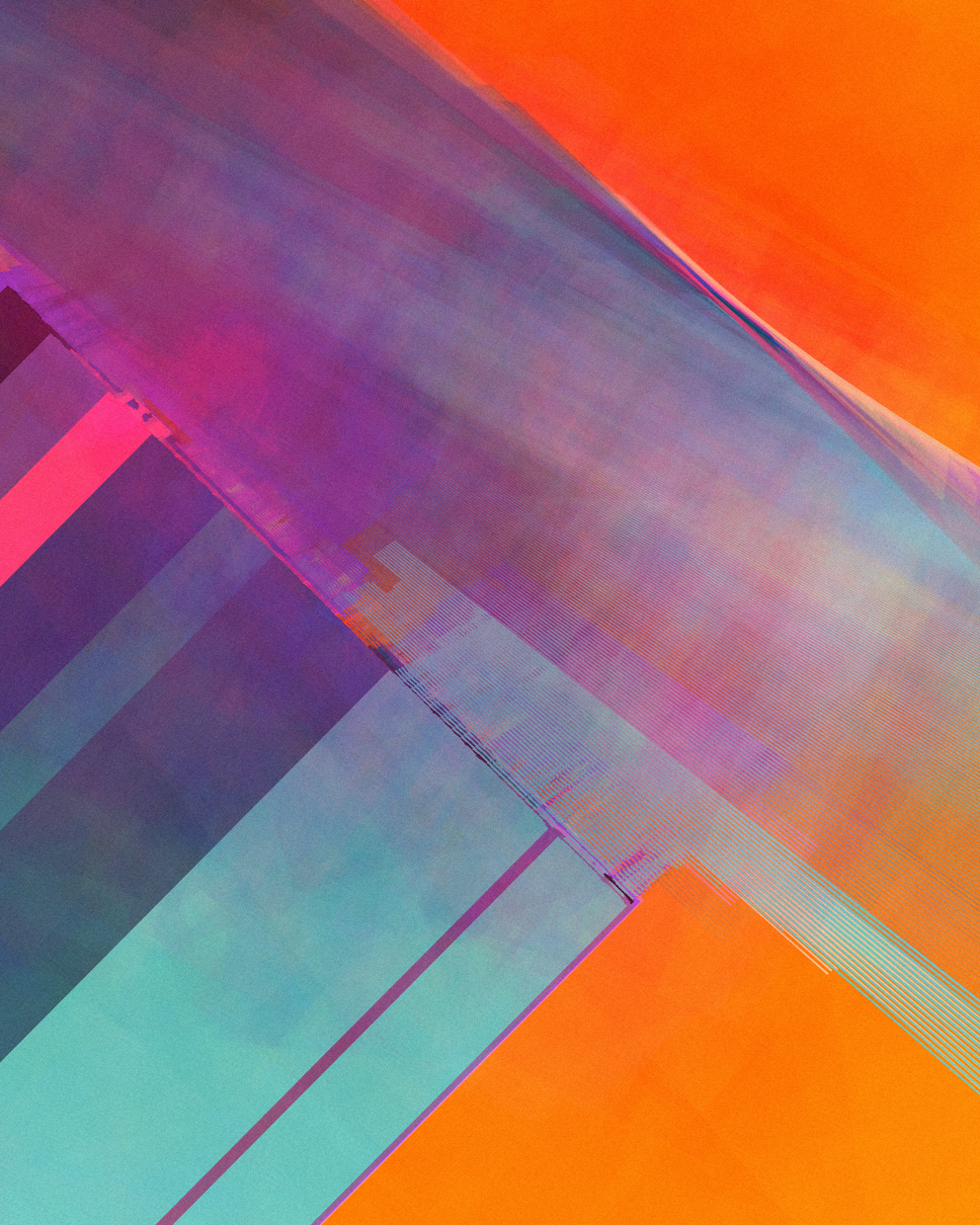
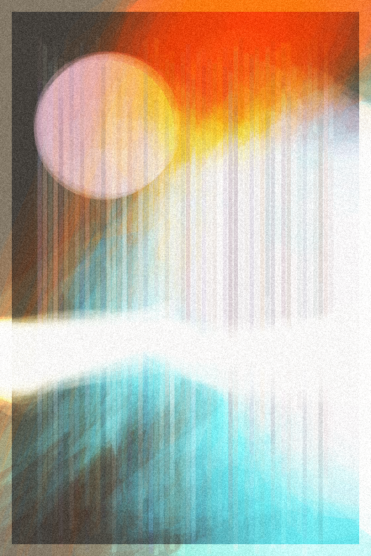
With Coronado (the project), I wanted to build in a little of the texture and personality that I've grown to love with it's namesake. I wanted a patina, of sorts, something that implied age, decay, blemish, character, maybe even a bit of wabi-sabi.
After coming up with an initial algorithm for the compositions, I revisited a technique that I used in vapour trails, a previous collection where I was trying to channel a little chaos and add atmosphere through a little color blending.
project name project name project name
The algorithm draws many overlapping shapes with low opacity to give a misty, ethereal vibe. It's a common technique, and it's really helpful for creating various textures or effects. Watercolors can be approximated with it as well, with great success, as you probably have seen in other projects.
But there's a few things to look out for... and if you're trying to make something look a little fucked up, like I was, you can bump up against them pretty quickly.
In p5, as you may know, there's a number of blend modes that can give drastically different outputs. The default blend mode just does a linear interpolation of the colors, which is nice and predictable... but with vapour trails I wanted something a little more dramatic/surprising, so I was playing with the OVERLAY blend mode which multiplies dark values and screens light. It's great for bleaching things out or going for something iridescent, if harnessed well.
Since vapour trail's release, however, Chrome changed something in how they interact with the gpu, or something, which messed with how it rendered the project, at least on an Apple M1, which is inside my machine. Sigh. (Don't worry, workarounds will be revealed in a moment.)
This was a bummer. It made me avoid using some of these blend modes for a while because the only workaround I could figure out was disabling some gpu settings on Chrome and relaunching.
By the way, if you're seeing this bug when viewing vapour trails, you can fix it by using this url in Chrome: chrome://flags/#canvas-oop-rasterization and disabling it. If you're still seeing issues, you can disable the gpu altogether with chrome://flags/#disable-accelerated-2d-canvas and see if that solves it.
This leads us back to Coronado... I still wanted to use these blend modes and was unsatisfied with the flag workaround. It seemed like a big ask to make people relaunch their browser just to see it. So, I read a bunch of stackoverflow and reddit posts but all things just pointed back to changing these settings or giving up.
I was frustrated... but then I stumbled upon a little workaround.
By default, Coronado renders without a frame/matte, but there's a key that lets you toggle it. When I toggled the setting, it rendered just fine on Chrome, even if the initial render failed. Interesting.
The reason this works is because I reuse the canvas between renders, and Chrome had already switched into cpu mode (apparently) when the pixels were loaded/updated to manually add the grain at the very end of the initial render... which primed the canvas for the second render. (Probably.)
In short, the fix is to call these load/update methods before you do any blending (even if you don't do anything with them) to switch how Chrome is handling things from the start:
    // create the canvas
    p5.createCanvas(width, height);
    // this should've fixed it, btw, but didn't :(
    p5.drawingContext.willReadFrequently = true;
    // this actually fixed it, hooray :)
    p5.loadPixels();
    p5.updatePixels();
    // (just make sure to call this before, y'know.. blending)
I was breathing easier but I wasn't quite out of the woods, yet.
Another fun thing about these blend modes (OVERLAY, SCREEN, SOFT_LIGHT and a few others) is that they may work a bit differently on certain browsers, namely Safari.
Below is a sample of one of those differences:
It's subtle, but it's noticeable. The left (Safari) is a tad more vibrant, but it's so much better than before... where the Chrome outputs were literally just a single solid color. Yikes.
But, in this case, I didn't mind. Honestly, I was happy with both versions for different reasons. Even when the differences were more dramatic, like below, I still felt like it worked.
It actually felt more true to the work that it had this idiosyncrasy. I might not feel this way for all projects, but for Coronado, it tracks. So it stays. It's true, I could've toned down the washed out, weathered look to the point where they were as close as possible, but then some of the volatility that I liked from the blending would be lost.
In the end, the effect I'm going for with Coronado isn't nearly as dramatic or weathered as the guitar that the project is named after, but the essence is in there.
The project isn't really about the guitar anyways, it's about the beauty and charm of imperfection, chaos amidst order, and letting go. It's about knowing that however much control we think we may have, things can all fall apart or burst into something unexpectedly wonderful at any moment, even without our hands tightly on the reigns.

