Working With Colors On Fêlure
written by Julien Pradet
Fêlure is my second piece available on fxhash.
The only thing I knew for sure when I started working on it is that I wanted to show that each one of us has their own cracks and failures that made us into who we are. At first, I thought that working on shapes would be the best way to channel those emotions.
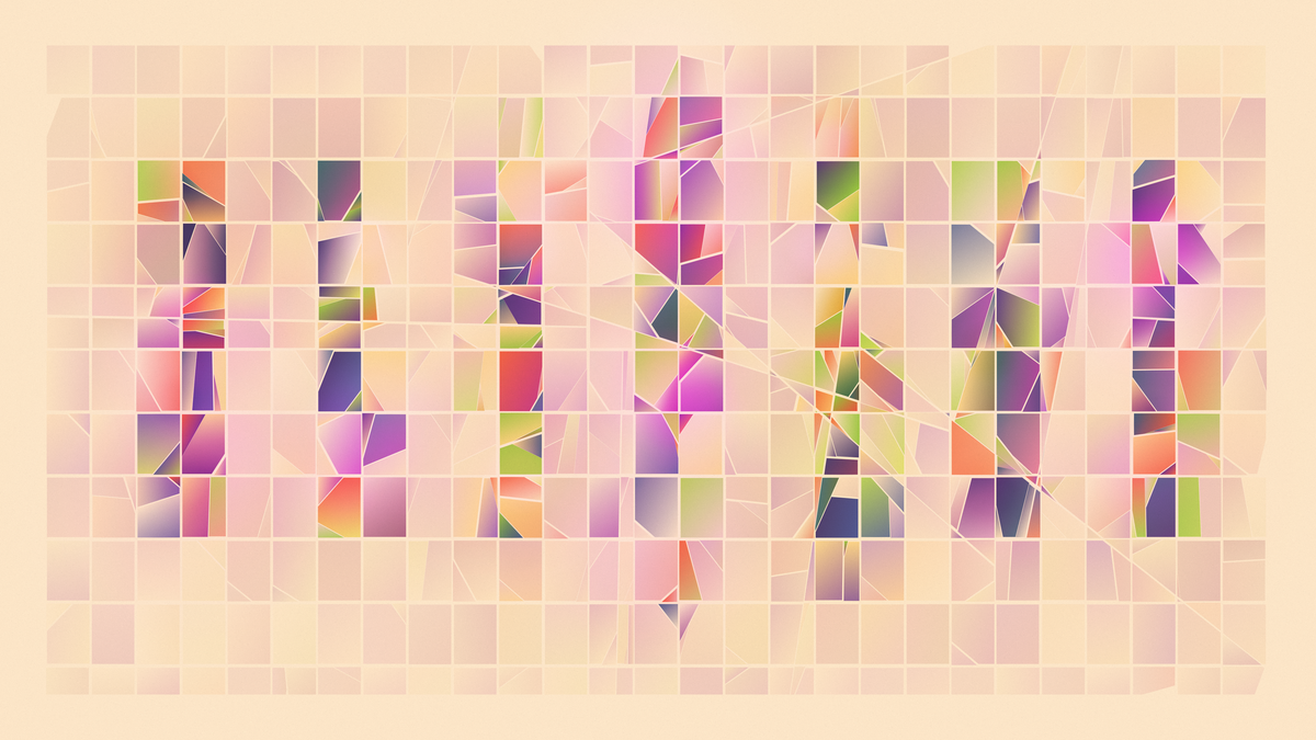
So I've worked on an algorithm that follow these steps:
- create a grid of rectangles
- create a texture that would transform each position into a value between [0, 1] (imagine a Perlin noise texture)
- Start a loop for each available shape and with an initial X value between [0,1]
- 1. split the shape in two if it's center has a value above X in the texture
- 2. increase X a bit
- 3. restart the loop with the new shapes created
- Repeat until no more shapes are created or X is too high
But when I first tried adding colors, reusing the exact same combinations as in As Light As A Feather, I understood that it was how this piece would exist. It was quite a bit of a journey though, so here is how it went.
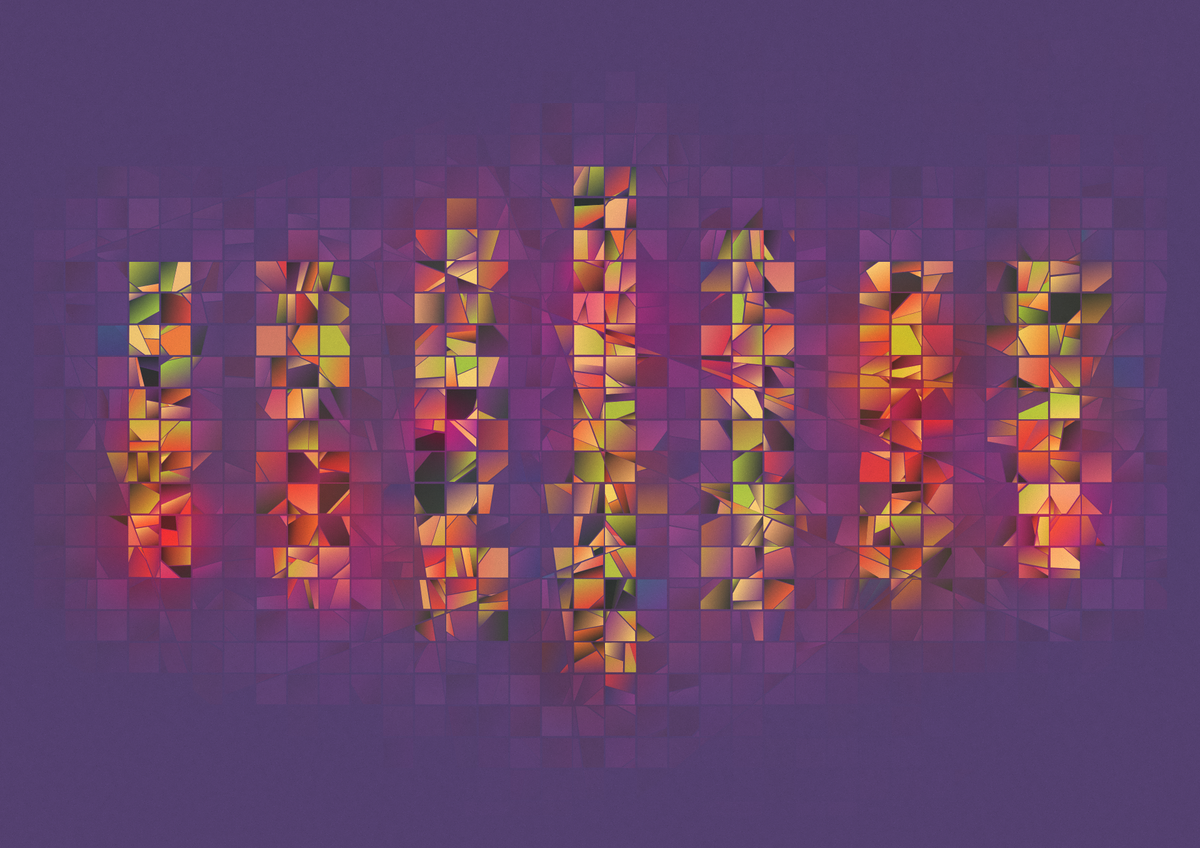
project name project name project name
Lessons from As Light As A Feather
I've shared a bit about how colors are built in As Light As A Feather in the following thread. Long story short, what made colors special was:
- the fact that I didn't use normal gradients but used the HSV gradients, clockwise and counter clockwise
- the fact that each gradients blended toward the same background color, creating some kind of harmony in the colors
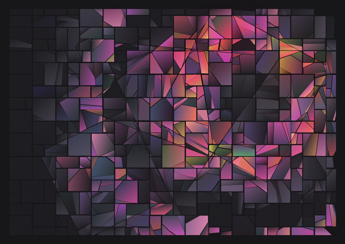
But there was something else that felt like it needed further exploration: the Glitch Color Mixer. Instead of creating gradients that blended the colors nicely in a single direction, it was randomly alternating between Clockwise and Counter Clockwise mixers. This resulted in the weird but lovely color behaviors you can see in the above image.
It was no longer a smooth gradient, but it still worked somehow. This is when I recalled this Bronze Bust by Adarias, a genius pixel artist.
Even though the colors shouldn't fit together, they balance each other. The shadows are a mix of some kind of teal and red-ish brown. But it still feels like bronze when you see it as a whole. So I thought I should try it out, especially since I had a perfect playground for it: tons of polygons sitting around.
Applying those lessons to Fêlure
So, first lesson was: blending the colors into the same background helped. So instead of assigning colors randomly, I've reused the Perlin texture mentioned at the beginning to get values for every single shapes.
Then, for each shape, I'd pick a color from my palette, and blend it into the background using the factor ratio from the values above. This resulted in :
- the bigger shapes being closer to the background color
- an harmony in the colors since they would go through the same hues (the purple colors in the examples below).
But it didn't really fit: since each shape had their own color and some shapes could be really big, the magic harmony didn't really exist. The missing ingredient compared to As Light As A Feather was gradients.
But the Bronze Bust didn't have any gradient. This led me to think that gradients wouldn't be enough to do the trick. Instead I've came up with two possible solutions to my problem: I either had to split shapes event further to create some kind of balance through quantity, or I had to decrease drastically the number of colors.
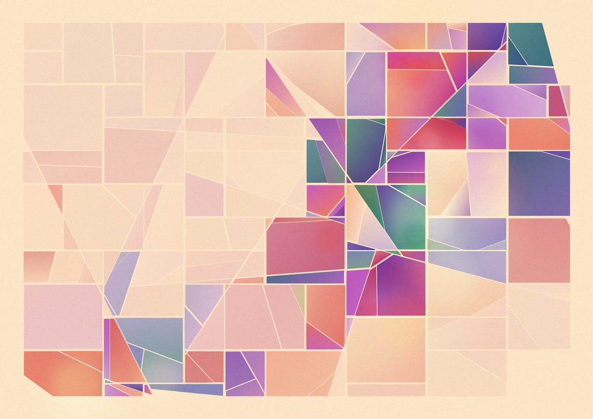
So this is what I tried in the above example:
- There are many more shapes and only 2 colors (excluding the background)
- The difference between shapes of the same base color is smaller (we can see the gradient between yellow to orange-ish beige)
- Reduced the number of colorful shapes by adding a threshold below which it's mostly dark
And this was the moment where it stopped being an experiment and started being a piece that I wanted to push further.
So I continued to do a lot of experimentation on the colors. As I stated previously, my goal was really to create uniqueness and make one feel like it's a completely different palette each time they look at it. This was my way of saying that it's ok to be different.
At this point, my goal was not to limit the algorithm, but to allow it to surprise me to better understand what could work and what couldn't. So I've added random values almost everywhere:
- number of colors
- saturation of colors
- hues of colors
- number of splits
- size of the grid
- etc.
It felt like it was almost impossible by using this technique to have mostly great outputs. But it led me to understand that readability of the composition was more important than the colors themselves. For instance, if there's too much space between shapes or too much contrast between colors that are too close to each other, it led to too much noise, making it hard to relate to the piece.
However, as soon as there was structure (especially visible when it's no longer perlin noise but specific texture patterns), it became interesting. So I had to find a way to simplify the shapes in some way to give more room to structure.
The other thing that I noticed is that it worked pretty well when there was only two dominant colors. In the end it was just like the teal and red-ish brown of the pixel art bust: colors were balancing each other out. It was still ok though to have some random colors that would standout from time to time: it helped keeping things interesting.
And finally, it looked flat. Shapes don't overlap each others in Fêlure. Even though there could be depth added through the composition, it didn't feel like it was enough. It was missing something.
By combining these three learnings, gradients came back into the piece: it was a way to have simpler shapes but still keep the balance and shades between colors. It had the additional benefit to create some depth by evoking shadows.
Fine tuning the colors
At this point, I really liked most of the outputs. But as soon as I let the colors get loose a bit by adding random to them, they were starting to produce some outputs I liked a bit less.
I felt a bit stuck for a bit, but then I recalled how I worked on colors before generative art. I used blend modes extensively (maybe too much 😅).
It was a nice trick to blend colors together. So I guess there would be no reason for it not to work on generative art as well? Afterall, I had globalCompositeOperation available in canvas to recreate the "overlay" and "soft-light" that I used extensively in Photoshop in the past.
I honestly didn't expect it, but it almost worked on first try. Always a nice feeling, uh? It brought this kind of warmth and depth that made it special in my eyes.
So even if I had some drawbacks because Safari does not support blurs on 2D canvas, it helped adding the finishing touch to the piece.
ℹ️ Side note:
I fixed the Safari issue by avoiding the blur filter and relying on radial gradients that went from opaque to transparent. It made the lights a bit less interesting, but it was way faster and it worked on Safari at least.
Another cool thing it allowed me to do was that it unlocked many possibilities regarding colors. I was kind of stuck with a dark background for a long time because it was the easiest way to have a neutral color that would create harmony.
But those blurred & blended lights allowed many more possibilities and made exploring different palettes easier. I was no longer locked into 2 dominant colors but could use many more.
project name project name project name
Closing thoughts
Overall I'm amazed by how different the project can feel between the first output and the final piece. I guess I should get used to the feeling by now, but by writing this down, it really helps me to highlight that just like Fêlure, regardless of what we're going through, it's the addition of every single steps that builds us.
Thank you for reading, your support means a lot to me, whether you've collected or not, whether you're broken or not. See you around 👋