Type-o-Graphic
written by fauxjebus
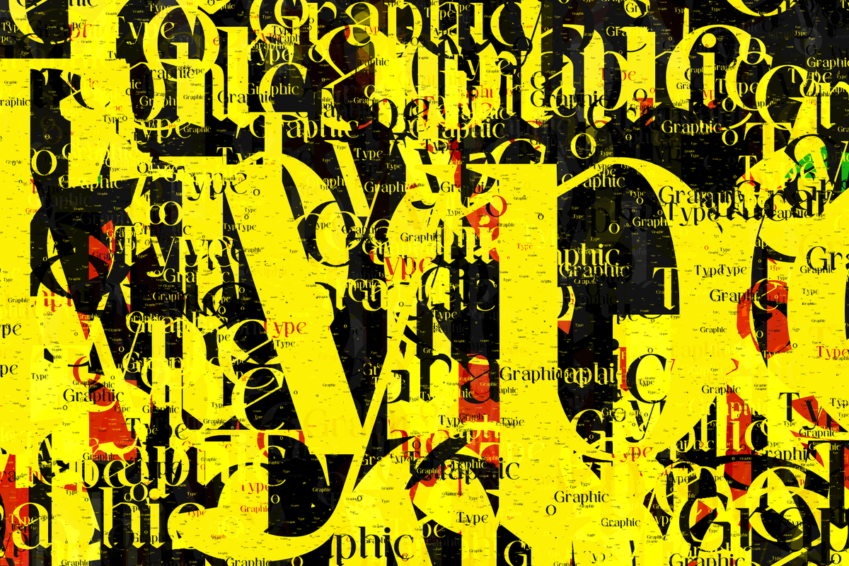
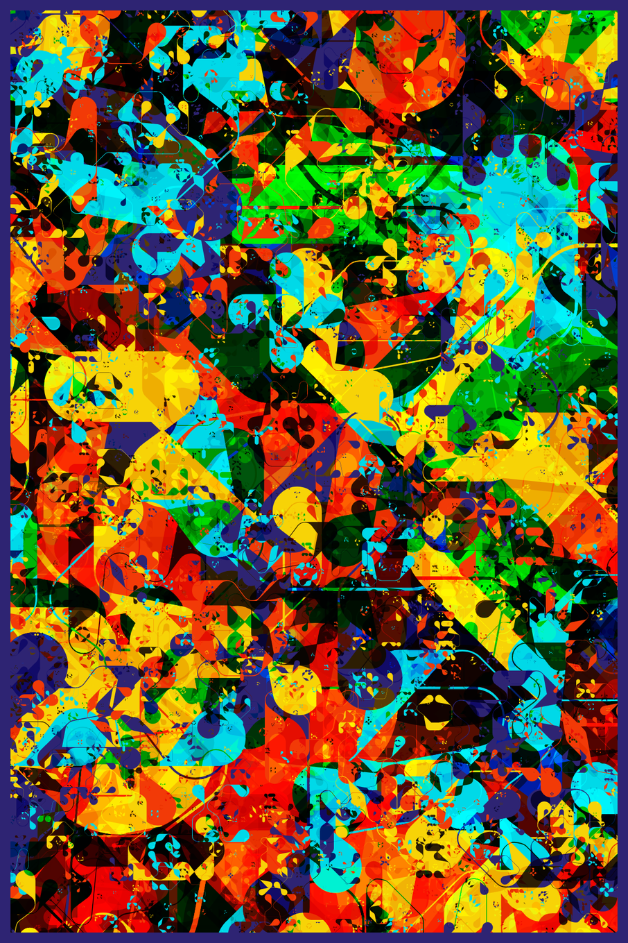
This project began with me experimenting in p5js, attempting to load a font and randomly draw characters all over the canvas. My self-imposed creative constraint was to create an algorithm that would produce compelling compositions using only typographic characters, or glyphs as they are called by type designers.
This got me thinking about David Carson, the iconoclastic graphic designer whose work and “nobody does it like you” philosophy have always inspired me.
“You have to utilize who you are in your work. Nobody else can do that: nobody else can pull from your background, from your parents, your upbringing, your whole life experience.” - David Carson
By looping the characters hundreds or thousands of times, changing the blend mode and making each character slightly smaller than the previous one, the outputs became much more interesting. I loved the overlapping colours’ depth and how my eyes wandered around the canvas, searching for interesting overlaps, pieces of letters, and combinations of letters that might form a word — the brain’s natural search for pattern and meaning. As the loop amount increased to tens of thousands, the canvas became covered in tiny characters that looked like dust or rough print texture.
I then experimented with an array of design parameters and features: colour palettes, fonts, blend modes, loop iterations, borders, aspect ratios, and interactive elements, in order to optimize the average outputs and establish acceptable tolerances for each individual parameter.
Skyline Mode
One of the interesting things I discovered was aligning all of the characters along the bottom of the canvas. I liked many of these outputs in testing, so I decided to include them sporadically in the collection with a 1 in 24 chance. Skyline mode is best with no border, so that all the tiny characters are visible along the bottom edge, although the border can be turned back on by pressing B.
Big Buried Character
To break up the uniformity that can sometimes occur when characters and colours are more evenly distributed, there is a 1 in 10 chance that a large horizontally-centered fully opaque character will be drawn partway through the loop cycle.
Colour Palettes
When testing colour palettes, I began by importing and adapting several that I'd used in the past. I was also eager to try many of the palettes from Studio Yorktown's fantastic Color Town Hall (thanks to Rev Dan Catt for pointing it out). Not surprisingly, many of them worked very well. Ten made the final cut of 43 total possible palettes (bottom row in the below photo). Thank you, Bruce!
Modified Palettes
I had an idea to try making modified versions of colour palettes that were already working well. I loved how this added another dimension of surprise to the outputs as even within the same palette there are now dozens of different ways it can be expressed leading to rare and surprising outputs more often. Colour palettes have a 1 in 4 chance to be modified:
Reduced palette - Removes a colour from the palette making it either disappear or much less common.
Loaded palette - Copies one of the colours in the palette 3 to 40 times, making it slightly or significantly more prominent.
Fonts
Looking for and testing fonts was one of the most enjoyable parts of developing this project, because I'm a nerd who loves type design and esoteric words like tittle and ligature. I began with the usual serifs, sans serifs, slab serifs, blackletters, etc. and found several from each style that I liked and worked well consistently. Scripts, italics and handwritten fonts did not work very well, so were not included.
As I explored more abstract fonts such as wingdings, pictograms, shapes and patterns, my font exploration became even more exciting. Ultimately, I chose about a dozen of these unconventional fonts, recognizing their ability to offer a complementary contrast to traditional letters and numbers and enhance the overall visual appeal of the collection. All fonts are used under the Open Font License or are explicitly permitted for commercial use.
Character selection - There is an 8 in 11 chance that the character will randomly change each loop, a 2 in 11 chance that a single character will be used, and a 1 in 11 chance that 2-6 random characters will be selected each loop instead of just one.
Rotation - Characters have a 4 in 11 chance to be rotated relative to an arbitrary point inside or outside the canvas. There are 4 possible types of rotation:
Interactive Features
My primary goal for this project is to have the outputs printed. I highly encourage collectors to personalize their pieces and have therefore provided extensive control over the final output via keys that modify specific parameters, resulting in thousands of unique variations possible within each piece. In case the default settings chosen by the algorithm do not suit your preferences, you can explore the features below and experiment with the parameters to find a better combination that resonates with you.
Portrait / Landscape
I decided on a 2:3 aspect ratio which is common for printed posters, usually being 12x18" or 24x36". By default all pieces will start in portrait mode, but can be switch back and forth at any time:
- Press L to switch the canvas to a horizontal/landscape format.
- Press P to switch it back to vertical/portrait.
Border
I found that most of the outputs benefitted from having a small border to frame the type and make the compositions feel more complete, but I also went back-and-forth on many that worked better without a border. So the border will be on by default (unless Skyline mode is on), but can be toggled on or off and the colour can be changed to any from within the currently selected palette.
- Press B to toggle the border on / off.
- Press N to change the colour of the border (picks a new colour from the current palette).
Background Colour
Most outputs will be too covered in characters to see the background layer, but in some cases where the amount of loops is small or the font is thin, it will be visible. Press K to change the colour of the background layer (picks a new colour from the current palette).
Top Finishes
There is a 50% chance of having a top finish layer added to the composition. The top finish layer can be toggled on and off with the T key. There are five possible top layer finishes that can be selected by the algorithm:
Mask - Draws 100 - 10,000 randomly sized opaque characters, half of which will mask out anything below them on the top layer.
Streaks - Draws vertical lines of tiny characters from the same font on the canvas, simulating printing errors and scratches that can happen on high-volume printing presses. Some of the more abstract fonts took too long to load with vertical streaks on, so in those cases the font for the vertical steaks gets replaced with dots to improve performance.
Dust - Draws between 10,000 - 100,000 tiny characters all over the canvas creating a dusty texture effect.
Extra Hit - Draws 5,000 - 20,000 mostly tiny characters all over the canvas. Sometimes results in large areas of the canvas being covered with a solid colour if a very large character is applied early on as seen here:
Noise - Draws tiny coloured dots of varying opacities all over the canvas to create a slightly more textured overall surface.
Blend Modes
There are 20 different combinations of blend modes that can be selected. Press the Left/Right arrow keys to cycle through the different combinations and find the one you like best with your chosen colour palette.
Resolution
Press the number keys from 0-5 to change the resolution as follows:
- 0 - 600 x 900 (low-res)
- 1 - 1200 x 1800 - 4x6" 300dpi (default)
- 2 - 2400 x 3600 - 8x12" 300dpi
- 3 - 3600 x 5400 - 12x18" 300dpi
- 4 - 4800 x 7200 - 16x24" 300dpi
- 5 - 7200 x 10800 - 24x36" 300dpi
If your composition takes a few seconds to load, press the 0 key to render in low-res while exploring different parameters and then upscale with a higher number key once you find a combination you like.
A big advantage of giving so much control over the final output to the collector is that it makes it easy to create pairs or sets, either all from the same initial output, or from different ones with similar parameters.
Thank you for reading about Type-o-Graphic! I eagerly look forward to seeing the final outputs and variations that collectors create. Please share yours with me (especially if you modify it or print it out!) on instagram or twitter @fauxjebus.
