Regarding Verdant Brut
written by Ty Vek
Hello, again.
First off, thank you for the lovely reception of my debut project, Commune. I couldn't be more grateful for the community having a a bit of faith in this lil' anon account. You're the best.
If you're not familiar with me or Commune, check out my previous article: Me, Commune, Etc.
In this article, I'm going to talk about the decisions made along the way and give props to artists who have influenced me and my upcoming project Verdant Brut, particularly in regards to palettes, composition and format.
Let's start with the format.
One of the first physical pieces of art that I collected—a bit over a decade ago—was by MOMO. They mainly did street art at the time, but this one-off piece was decoupage on a small wood panel. They create enormous prints made in ingenious ways and have evolved into primarily a muralist that has decorated (and improved) buildings across the globe. Check out their website to get an idea of their work. A truly impressive body, even if they aren't into NFTs, yet.
It only cost £20, but was my entry into collecting. I'll never part with it. Have a look:
It lives right above my turntable and I'm delighted that I get to check out its tactile vibes whenever putting a new record on. It's by no means indicative of their trademark style, but I know who did it. My dream is to commission them to put a mural on one of my walls at home, but for now... I have this little treasure of paper pasted to wood.
To back up a second, I played a bit with creating a wood grain texture while working on Commune, but it didn't feel right as the default texture for it. That collection was supposed to feel somewhat like blueprints viewed from overhead, which made the paper grain more natural. Even so, it's an option there, y'know, for fun.
project name project name project name
With Verdant Brut, however, I wanted to make the piece feel like it was upright... on a wall, screen, whatever... and feel like a physical object. So, I continued tweaking the wood grain and made it the default. It brought it into the real world a bit; I wanted it to feel like it was painted directly on primed wood.
Naturally, there's a palette directly inspired by the MOMO piece above, but I wanted to pay homage to other folks that have also had an impact on me, not only in composition, but in color selection. Some of them are dead masters of modern art, and others are alive and well and also releasing their work on fxhash, like me. If that's you, hi!
The palettes are directly inspired by individual works by the following artists, even if they aren't their trademark colors. I wanted to choose pieces that are in the same family of what I was attempting with Verdant Brut, some more in that family than others, but relatives all the same.
These artists include: Melissa Wiederrecht, Erik Swahn, Marcelo Soria-Rodríguez, Paul Klee, Mareva Millarc, Ernst Mether-Borgström, Douglas Herbert Courtenay Auburn, Jim Harris, Alayne Spafford, Man Ray, Lajos Kassak and William Lachance.
Please note: some of the palettes have a large number of colors in them, and may not all be present in a particular iteration that uses it. It's even possible—in rare cases—that none of the colors are visible. This is due to the layering nature of the algorithm and its "Monotony" level, a trait that makes the piece more monochromatic as it goes up.
Below are the pieces that I used as reference. I was going to label which artist made what, but it looks better this way. Even so, I bet you can identify at least a few. At the very least, the one mentioned above.
Verdant translates to "lush, green" or "inexperienced, unsophisticated" depending on its usage and brut means "dry, raw, or unrefined."
While the piece doesn't really evoke impressions of nature, or show vegetal growth, I'm using it loosely to reference to the lush, vivid world that abstract art can provide. And while certain iterations of Verdant Brut serve Brutalist vibes, I'm really trying to focus on the "unrefined" element of the definition and not explicitly the movement. I'm also leaning into the "unsophisticated" alternate meaning of verdant here. Less can be more.
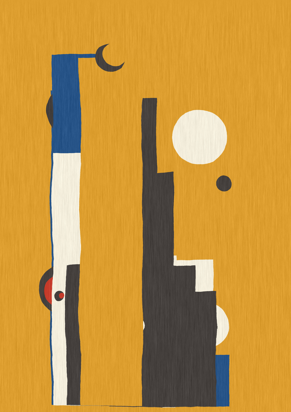
Much like Commune, I treat the shapes in a way that feel irregular and organic. I'm hoping the compositions deliver a playful—adolescent even—execution. I love simple shapes and layering them in straightforward ways, but in a way that leaves chance to the possibility for surprising and delightful compositions.
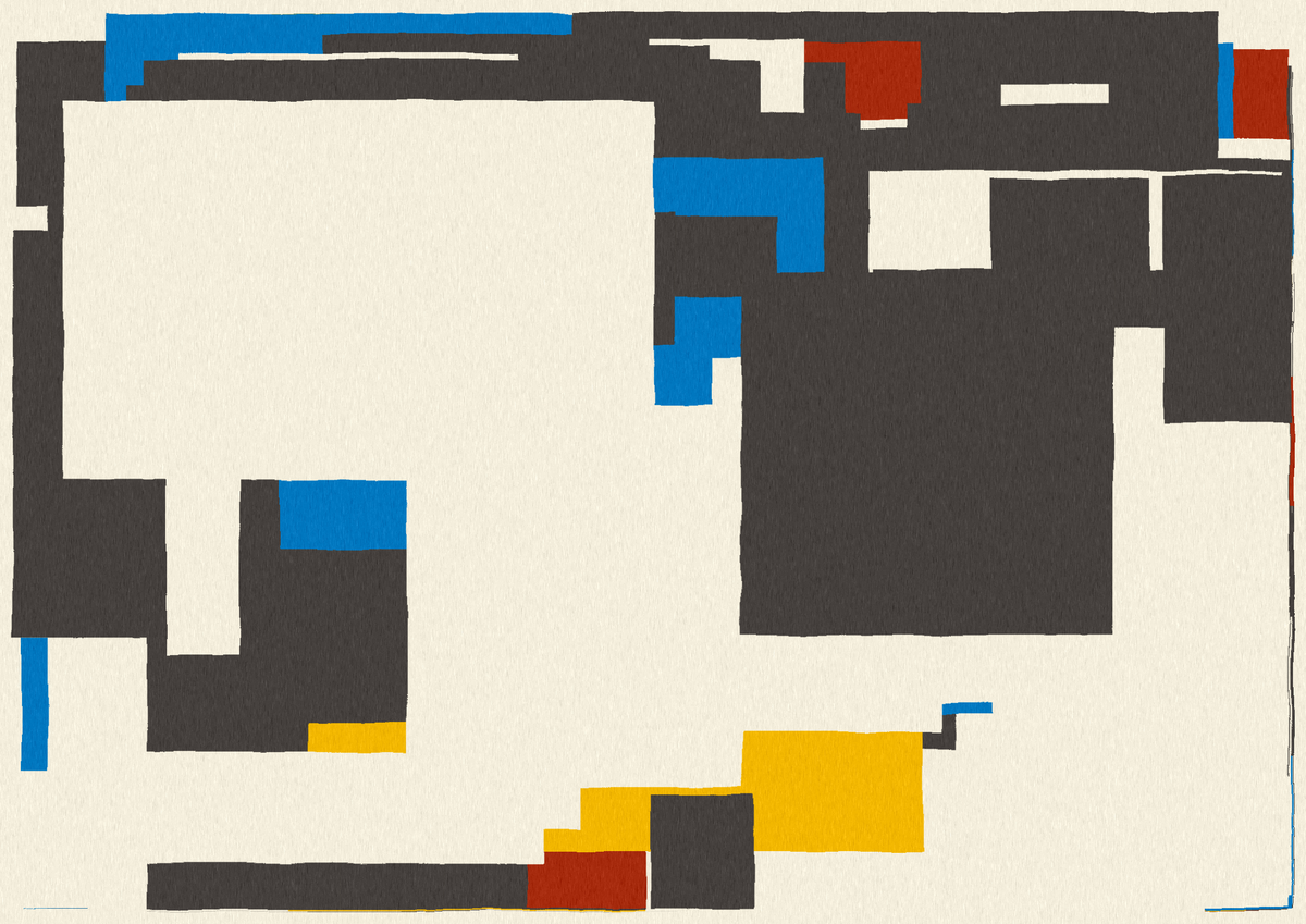
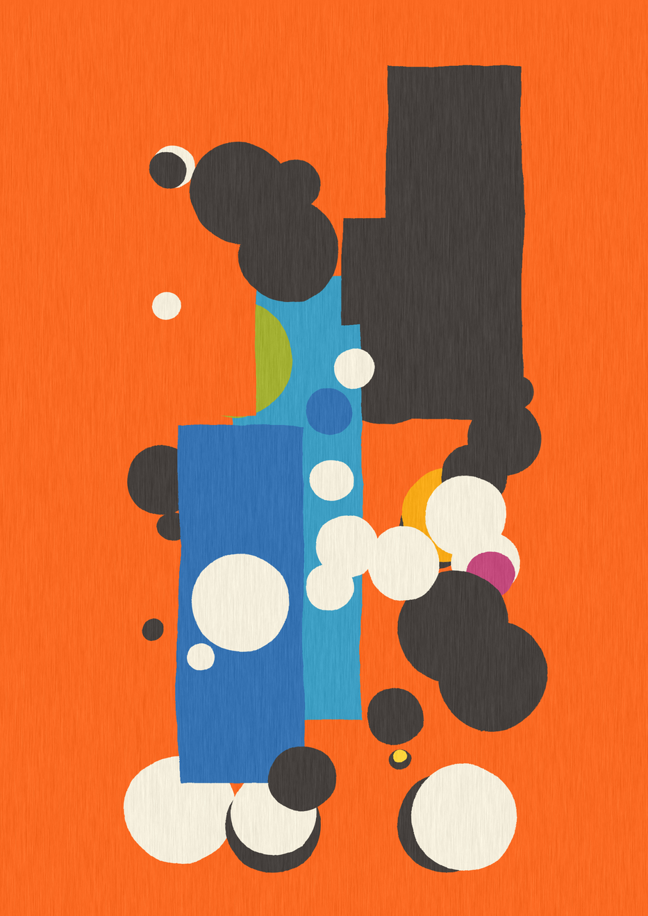
Here's a few of the directions it can go, all stemming from a few simple rules overlapping rectangles and circles, relying on a little controlled chaos and algorithmic nudging to create diversity and some sculpting to give a more handmade character.
The outputs can range from leaning towers (yes, 3.99°, just like that one in Pisa) to obtuse portraits and bubbly washing machines, apparently—with lots of room in between for purely abstract forms.
Ultimately, I wanted to create an abstract piece with compositions that could accidentally bleed over into impressions of reality but in distilled, restrained way. Inevitably, with these shapes, there will be cityscapes whether intended or not. In any case, some will be minimal while others more intricate.
Now, a little coding tip, which I'm going to try and always include in my project write-ups.
In this case, it's a technique that I noticed while looking at the source code of a project on Art Blocks. Unfortunately, I didn't take note of which project it was or even who the artist was, and for that I apologize, but I am grateful to them for their clever optimization.
You may already know this, but I try to keep my algorithms as terse as possible. Commune was only 2932 bytes, but Verdant Brut weighs in at a slightly more weighty 4878 bytes without any external libraries or shaders.
Why almost double the size?
Two reasons: a more complex algorithm for the composition plays its part, sure, but most of it comes from having 13 palettes, most of which are longer than any in Commune. Even with scrapping all the non-monochromatic palettes from Commune and starting fresh, palettes account for about 25% of the code here.
So what's the trick?
Pretty simple, as all good tricks are, and that's just to remove as many unnecessary characters as possible and reconstruct data structures as you need them.
Here's the original code that I found:
const B="fefdfb1d1517302332dd2e26f87d68fcc2cbf55b4dfcc79ef7d86ea0b8acb4aab2-f2bf58ffdd8ce37f445458737660654e342b45414a120d0e-de2c2cfff8e8fcd581d52941990d35-d726383f88c5f49d37140f2df22b29-183945116973F67C1FD82B03F2F2F2-a31621bfdbf7053c5e1f7a8cdb222a-1e90ffff514eff7700f7e3d569b6682b9091486abd282e39-b8b8d15b5f97319177ffc145ffe0a0fffffbffb5b4ff6b6c-1b3b4bd40000b68762eef2f6e6e0dae0b299eda67de2725b-0505041d34611f487d237ba133b2cce6e6e6fdd692fb3640-1d2f53ec5c23fdc449f5f1ebf8b8a03cb8a472c1c65898c1-ffbb33f1faeea8dadc457b9d1d3557031927424b54042a2b-26437fffcc00d2292effffff0000001884bffefddfd9381e-ccdbdc9ad1d480ced7007ea70032493d5a80ee6c4d293241-d00000fefefa3f88c5032b43136f6337323e96c8a2001242-05668d02809000a89602c39af0f3bdf7e7cefffaf000bbd8-3f3f37d6d6b1f2e0b6e6a100f24500-ff8f9effa8b5ffbdc9ffd5d1ffecdbe30022ffd0b3ffb9a3ff9e8fff8f8f343434-247ba033b2ccfdd692ffcc33ff8c00fb364000563fff91af-d3cdc3F03000f78355ee7749F03C004b3934260c1a252422-40190617171af0a000f0c630f0d9a5f0d0c0ff0015cceeff-095c842e84a68eaccbe7eef5e1bf9bc48e1b876930241e05283224".split`-`.map((e=>e.match(/.{6}/g).map((e=>"#"+e))));
Pretty clear, right?
Let's start with how a more straightforward version may look:
const palettes = {
  "Palette A": ["#FFFFFF", "#000000"],
  "Palette B": ["#FD0C0B", "#EEA441", "#2C7A49"]
};
Ok, hopefully this is a bit easier to parse.
We have 2 palettes, with a few hex codes a piece for each.
The only problem is that there's a lot of unnecessary quotes and "#" chars that we can get rid of, if we want. And yes, we want to.
What the cryptic snippet of code does to accomplish this is smash all the hex codes into one string (sans "#") and then when it's time to run, it cuts them up into pieces (the palettes), and then into even more pieces (the colors in each palette), places them in an array, prefixing each color with a "#", and then finally... create an array of those arrays. Cute.
For Verdant Brut, though, I wanted to have clear palette names to shoutout the artists I was referencing.
So, I basically did the same thing, but a little different.
My palette code looks like this:
const cA = (str) => {
  return str.match(/.{6}/g).map((e=>"#"+e));
}

let palettes = {
  "MOMO": cA("F31E1E102F5AFFC616F4F40D12B3A6"),
  "William Lachance": cA("FD0C0BEEA4412C7A49FA026AFFD8EDE8C62F1E7FCD69BD990B164CF5819C"),
  // ... skipping all the palettes for a little brevity here
  "Erik Swahn": cA("FB69223E9EC3A3B032C34A7BF7A917FDD43A3572B2"),
  "Ernst Mether-Borgström": cA("CFDEEAD7D0CB84BACFF5EF531E1E20CA3F394A4B71895A74AC7154EF8C5D5977BE8B9ABA79443D23433B5C86475E181AE7D061")
}
I decided to create a helper function, cA, that would take the string of mashed up hex codes and return an array of the sliced up colors, prefixed with the "#" so they can be parsed as colors. This way, it's still pretty readable, and when its web-packed it comes out a way smaller than the super clear version.
In my case, this saved around 500 bytes, which made me quite the happy little nerd. There's only one "#" and we've minimized the quote situation by a lot.
And yes, I could've saved a few more chars by creating one huge string using different token delimiters between palette names, palettes and colors, but you gotta draw the line somewhere. right?
5 bucks this haunts me and the final code does this. We'll see. I feel this is a good balance between readability and optimization. You can almost always optimize more, but like anything, balance isn't the worst thing. [Update: I didn't.]
And that's it, I'm really excited to release Verdant Brut on Friday, November 11th.
Thank you so much for reading. I hope you enjoy Verdant Brut, or at least found the javascript palette optimization helpful.
You're wonderful.
** I'm charging a small amount in an attempt to dissuade some folks from hoarding large amounts for free, otherwise, this would've been free to collectors. I apologize.

