Pano process
written by Eduxdux
The beginning of the work
It all started one day when I was having lunch at my parents' house and I noticed the cloth that my mother placed under the plate. I knew it as a sousplat. However, after researching I discovered that in English it is called a 'placemat'.
While looking at these placemats I noticed an interesting pattern of colors and geometric shapes that the lines formed. It was a crocheted placemat, and the colorful textures created a very interesting composition with the play of shapes. After this, my time spent at lunch increased considerably, as I was admiring the placemat I have here at home. Even if it wasn't as beautiful as my mother's, it was still beautiful (photo below)
After this time of admiration and obsession, I decided to reproduce it my way with code. I then started creating textures. They were not exactly like the initial reference; I just wanted them to be interesting.
In the photos below you can see the first texture tests using p5.js:
Great! After some experimentation, I got a texture that I considered decent and that would work to create a “virtual placemat”. At this moment I had only made stripes. I considered them beautiful, but they were too simple and didn’t generate diverse and unique results. From there I had to carry out another round of research and studies to find a composition that made sense and matched the theme. I looked at the works of Gunta Stolzl and Ruth Hollos-Consemüller, Bauhaus artists known for their tapestry pieces, and from this reference, my composition began to settle: squares in rows of irregular sizes creating contrast and union.
However, a problem arose from this composition: mostly aligned horizontal rectangles begin to look like colored bricks. I think these are beautiful, but it is outside the textile theme. Trying to solve this problem, I inverted the orientation; when the rectangles were mostly vertical, this change made everything lighter and more dynamic.
Happy with the composition, it was then time to worry about variations and color palettes. Since it is a composition formed mostly by rectangles, created with contrast, it was necessary to adjust the colors so that it did not happen as in the example below, where there is almost no contrast and it looks blurry.
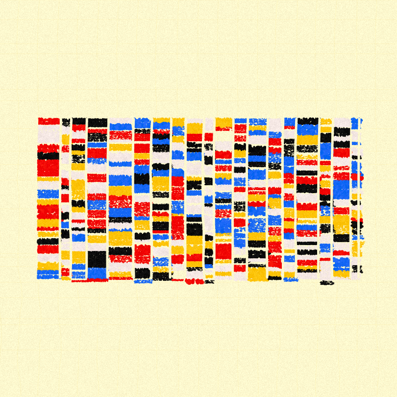
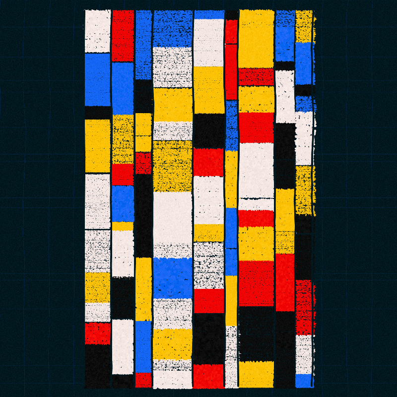
Now it was time to start creating variations. I began adjusting how the shape of this placemat would be: horizontal, vertical, or occasionally square.
I then made adjustments to the sizes of the shapes, to increase the geometric possibilities.
After that, it was just finishing touches: adding a kind of “grout” between the shapes, and a special background that only had 30% filled.
