Impressions of Order
written by nbswwit
Introduction
As a child I used to enjoy dismantling electronic devices. To me, there is a distinct feeling of excitement and awe that comes from breaking apart scuffed plastic casings and revealing complicated inner workings, that ‘somehow’ – almost inconceivably – made a device function. Today, I get similar feelings when looking out over busy cities or walking in nature. I think it is partly an appreciation of scale and complexity. However, I also think there is a simple joy that comes from observing something that feels too complex to fathom. That moment where you stop trying to understand or intellectualise the thing, and simply enjoy the spectacle.
What I find most interesting about these feelings is how they persist after the physical experience is over. That is, after the electronic device has been dutifully reassembled or the expansive city view is out of sight, something remains - etched into our minds – that allows us to later recall feelings of the thing that we could not fully comprehend.
I find these residual “Impressions of Order” interesting for several reasons. Firstly, I think they must be fundamentally partial, flawed, and littered with various types of imperfections. Secondly, I suspect they express interesting non-uniformities in relation to our distribution of certainty. That is, some elements within these “impressions” may be more accurately and definitively captured, whereas other elements (or perhaps entire areas) may be much less certain and have a tendency to breakdown under scrutiny to reveal something akin to “yadda yadda yadda…”. Thirdly, in addition to these low-level imperfections and areas of fragility, there would also need to be something that cements the appreciation of order and deep-seated coherence, in order to help us regenerate the feeling of complexity rather than pure randomness.
This collection is about these “Impressions of Order”.
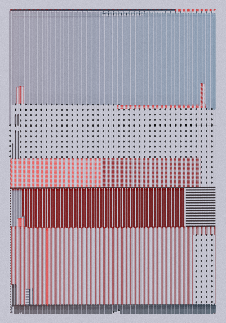
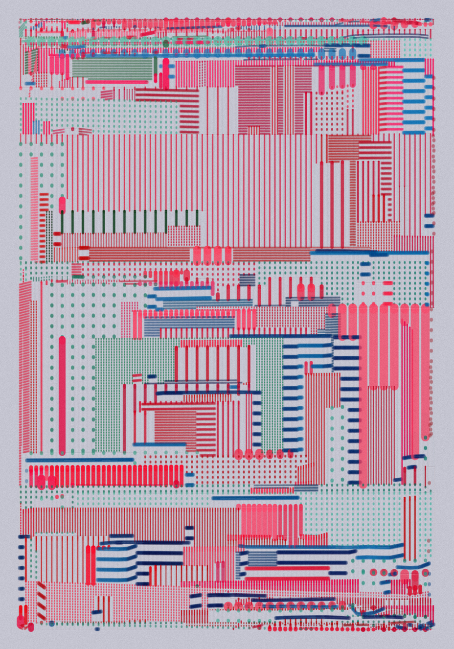
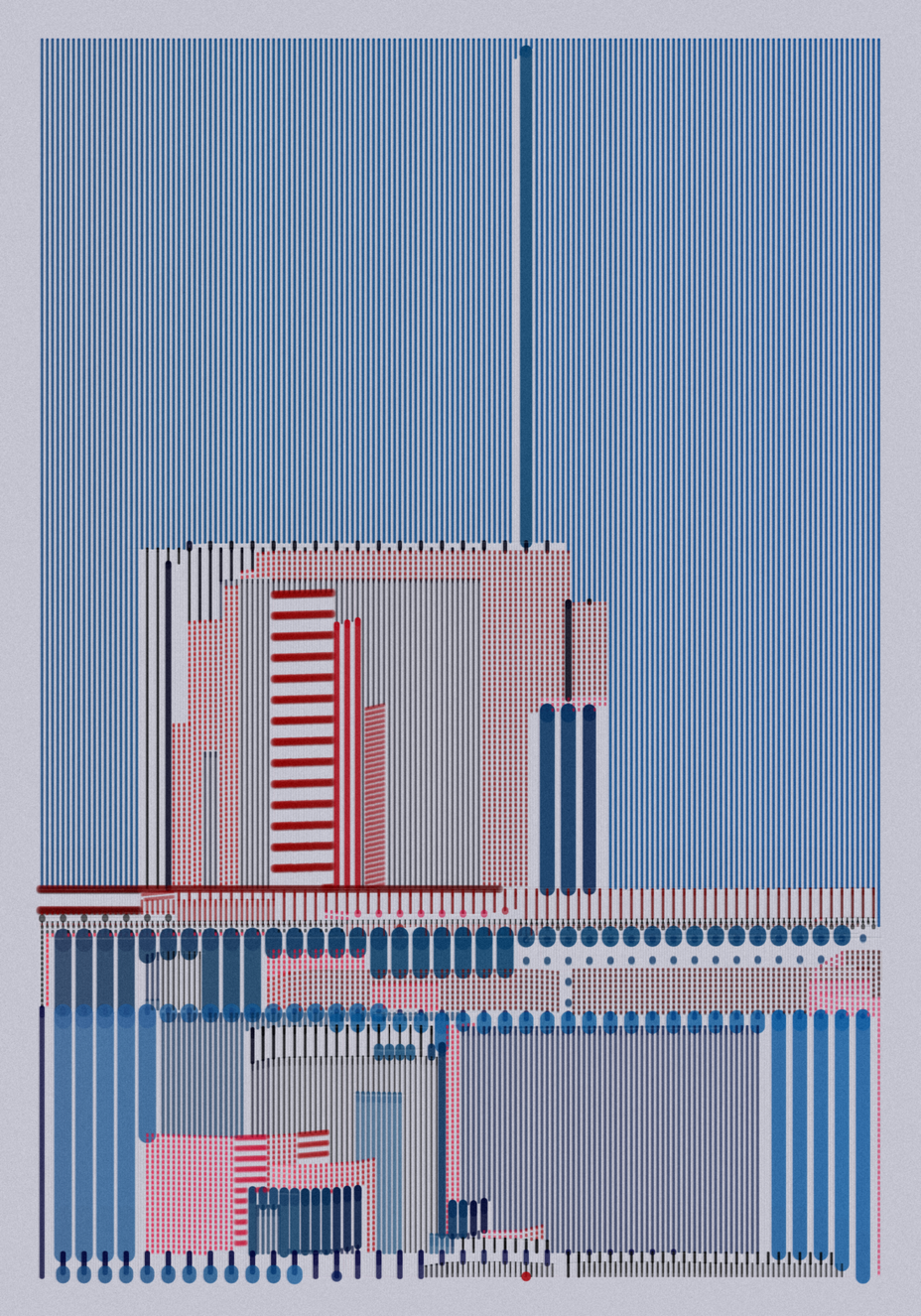
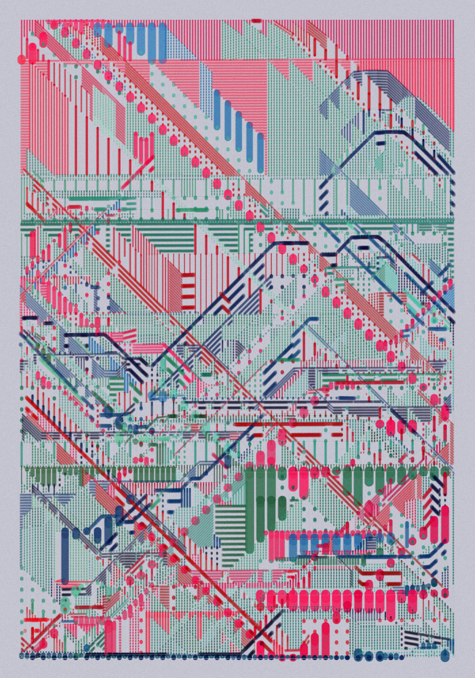
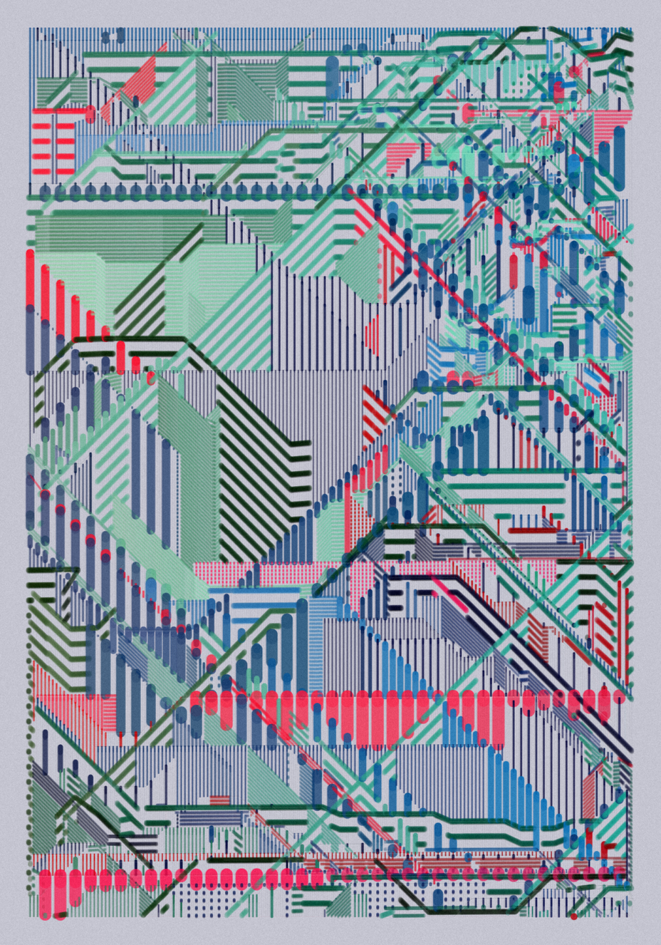
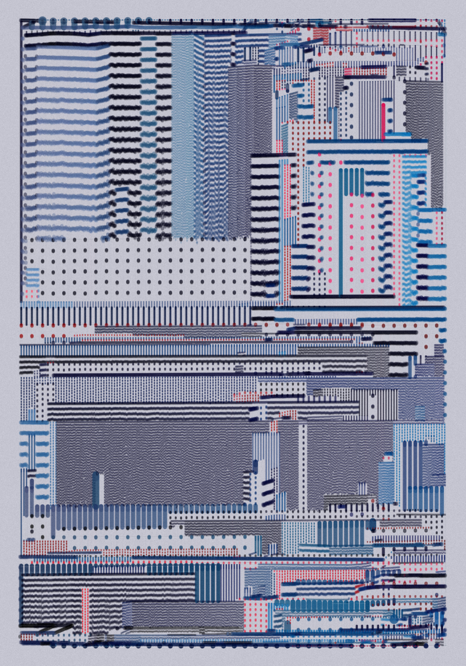
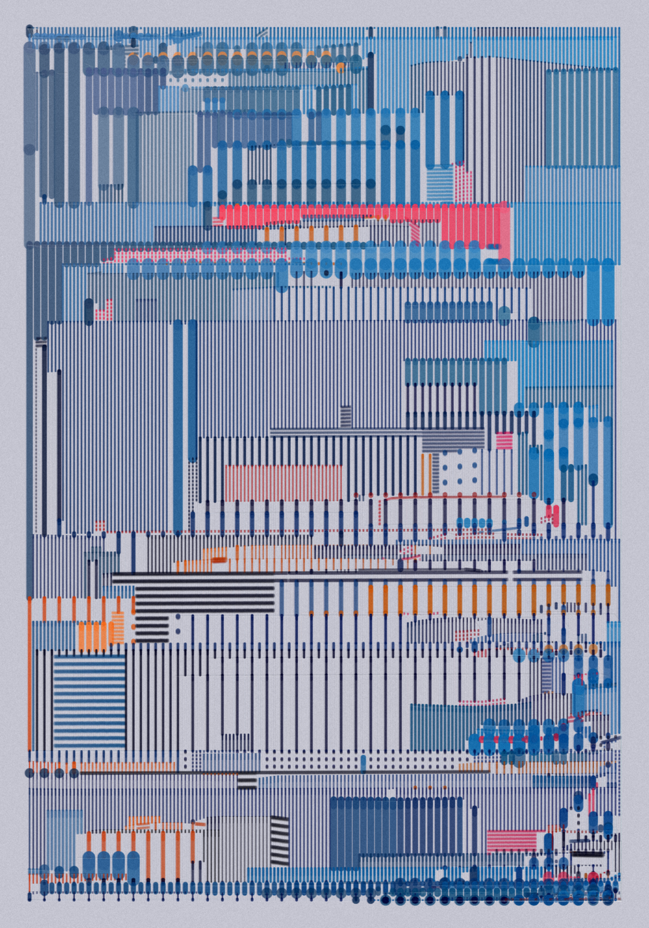
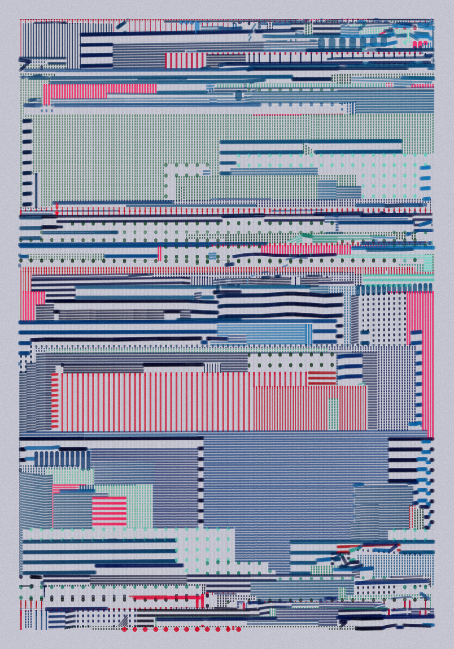
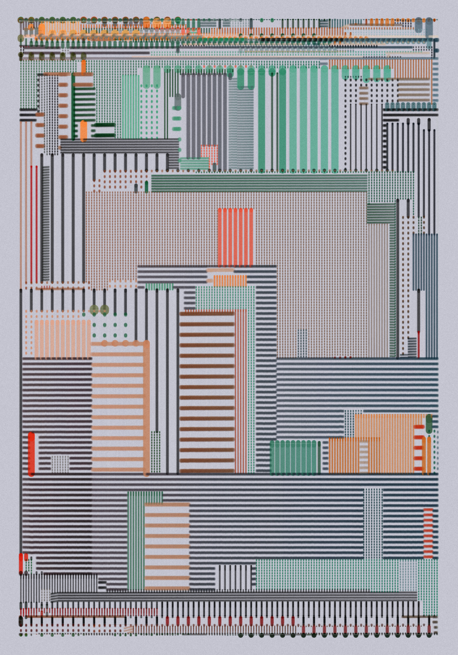
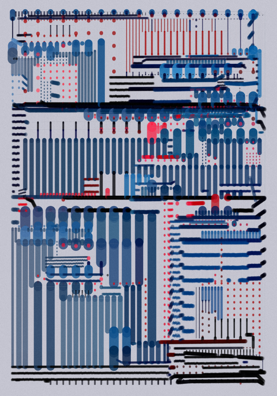
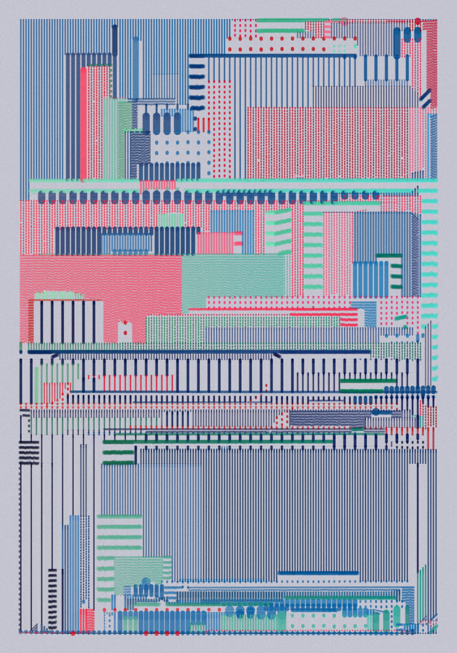
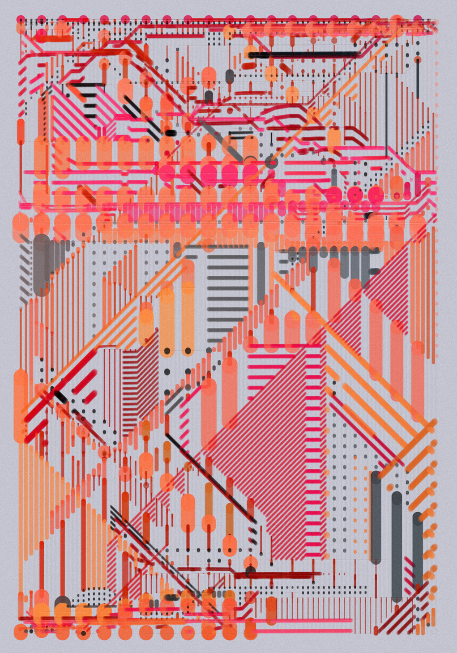
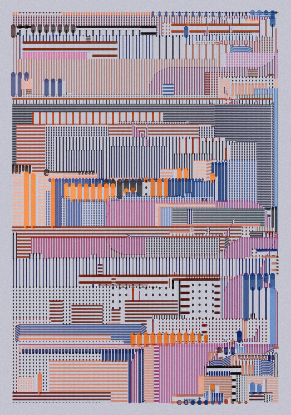
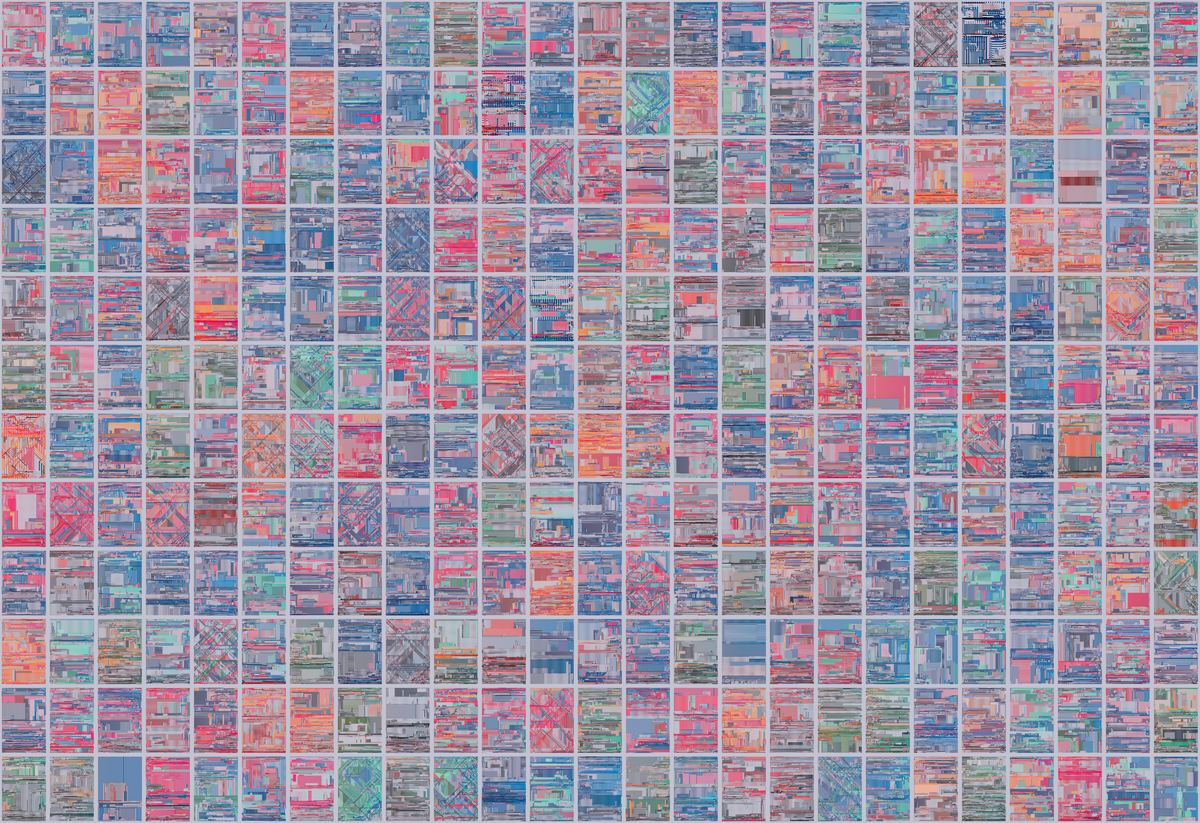
The collection consists of 300 generative compositions that each seek to explore these ideas relating to the perception and documentation of order within complex systems.
project name project name project name
Core Algorithm
Conceptually, the algorithm is quite simple and has two main parts. First, an agent system is deployed to create a series of constrained paths, then a process similar to a “scanline fill” is used to plot lines and dots inside of the zones created by the agent paths.
Agent Paths
The underlying agent model is based on Craig Reynold’s 1986 “Boids” program, which is a well-known algorithm for simulating the flocking of birds. The Boids model is deliciously simple as a process, and comprises a set of agents that move around on a two-dimensional canvas using three simples rule sets to control their speed, position and direction.
For this project, I made three notable adaptations to the Boids model:
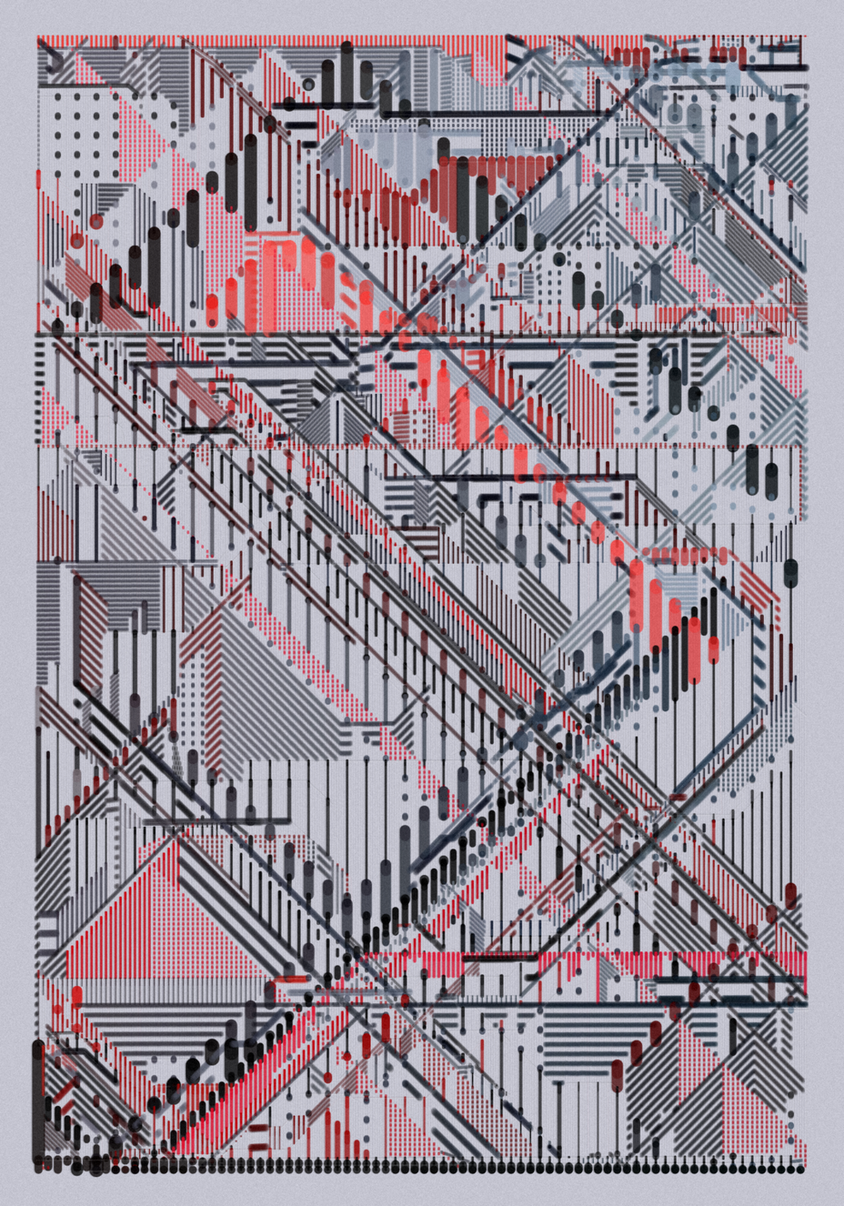
Firstly, the directions that agents can move are constrained to 90-degree or 45-degree increments. Notably, these angles correspond to the “View” feature in this collection, where 90-degree constraints mean that agents can only move in one of four directions (up, down, left, right) and are called “Ortho” views. Whereas 45-degree constraints allow eight possible directions (the four above and their diagonals) and are called “Iso” views.
Secondly, each agent behaves differently. In the traditional Boids model, all agents tend to behave the same. For example, all agents will do the same thing when they reach the edge of the canvas, and all will have the same “neighbourhood” size…etc. In this algorithm each agent has individual behaviours that are randomised upon creation, meaning that some agents will bounce when they hit the edge of the canvas, and others will teleport to the other side (i.e. wrap-around), and each will behave slightly differently across a variety of other metrics when they interact with other agents.
Thirdly, agents create paths that are packed with data that can be interpreted by a later scanline fill process. Upon creation, each agent is seeded with information that describes how their paths will be used to generate lines and/or dots with different spacing, sizing, and colour in the second part of this algorithm. This information is linked to agent paths.
After the agents have performed their flock and each has memorised a set number of steps (the number of steps memorised relates to the “Memory” feature of the project), two further operations are used to improve computational efficiency and add more personality (i.e., more “yadda yadda yadda”) to the resulting paths.
First, the memorised points that comprise the constrained agent paths are projected perpendicular to the direction in which they were drawn. This introduces non-random deflections and imperfections that can be seen on the image below. Less path distortions correspond to the project feature “Extra Neat: true”, whereas more path distortions lead to “Extra Neat: false”.
Secondly, the distorted paths are then “cleaned” such that they can produce the same shape with significantly fewer points before they are sent to the scanline fill process.
Scanline Fill
Once the paths have been created, a series of vertical (always vertical!) lines are drawn with varying size and spacing to fill the empty zones between the agent paths. This is done using a “scanline”. The scanline is essentially a vertical cutting line that moves from left-to-right across the canvas, and at each step three procedures are completed:
- Identify any points on that agent paths that intersect with the scanline.
- Order the intersection points vertically (i.e., along the y-axis).
- For each intersection point, use data related to the agent that made the path to draw a vertical line between that intersection point and the one below it.
As noted above, all lines are drawn vertically – however, as you have probably noticed, the completed compositions visually comprise a mix of vertical, horizontal lines, and dots. This is achieved quite simply. For the lines that appear as vertical lines, one line is drawn directly between the two points of intersection. Whereas for horizontal lines, a series of vertical dotted lines are created that give the impression of a horizontal line when stacked next to each other at small intervals. Finally, a grid of dots is simply created by increasing the horizontal spacing of the vertical dotted lines.
The image below helps to visualise this with a zoomed in debug view, whereby the agent paths are shown with their corresponding colours and only 50% of the scanline fill is displayed.
This debug view will be airdropped to collectors (of the collection, not this article!) on the 31st January 2023 as a token of appreciation for the support. 300 editions will be airdropped - one for each iteration held - snapshot will be taken on 30th January 2023.
As described in the project description, the pieces in this collection are designed to be viewed in high resolution (by pressing “4” or “6” on your keyboard to re-render at 4K or 6K pixel resolution).
At these higher resolutions you will start to notice a variety of details that explore ideas relating to “residual impressions of order” – and specifically, the ways in which a machine may attempt to document and express these.
For example, you may notice more and less confident documentation of elements as expressed with different treatment of edges (primarily seen in horizontal lines), you may also notice colours and elements blending together via layering / feathering of many smaller stroke marks with low opacity. You will likely also spot glitchy imperfections, ghostly traces of agent paths, soft grain, and areas that tend to breakdown under scrutiny to reveal individual stroke marks.
Colour
Colour is a key component of this collection, and a part that I had a huge amount of fun exploring. There are ten palettes in this collection. The least common is: 🔵 🟠 🟣 ⚫ which is used in 2.33% of pieces, whereas the most common is 🔵 / 🔵 / 🔴 which is used in 16.33% of pieces.
The colour swatches for each palette are slightly complicated, but in essence the direction of the agent path (i.e., the direction that the agent was “heading” when the path was created) is used to query an indexed colour swatch for each stroke created. This means that as the direction of individual lines change (often subtly due to the distorted agent paths) we also see the colours become slightly darker or lighter. Ultimately, I think this detail is felt more than seen in the final work, but it is a key component of driving coordinated variation into the compositions.
Project Features
Now that the basic algorithmic process has been outlined, it should be easier to read the compositions in relation to the various project features.
Complexity
The complexity feature is a measure of how many agents were used to create the original paths. Most pieces within this collection have "High" (~64%) or "Very High" (32%) complexity. However, there are five pieces that have "Low" complexity (~1.6%).
project name project name project name
project name project name project name
View: Iso
There are 27 Iso pieces in the collection (9%). As described earlier, an Iso view is created when agent paths are constrained to snap to 45-degree increments instead of the more common 90-degree increments. This produces compositions which feature diagonal (isometric-like) elements instead of more orthographic-like compositions.
project name project name project name
project name project name project name
project name project name project name
Line Direction
Most pieces have a relatively equal mix of vertical, horizontal lines and dots. However, some pieces have a strong bias towards producing vertical lines (~7%) and others have a strong bias towards creating mostly horizontal lines and dots (~5%).
Line Direction: Mostly Y have a bias towards creating vertical lines:
project name project name project name
Line Direction: Mostly X and Dots have a bias to create more horizontal lines and dots.
project name project name project name
Extra Neat
There are 28 pieces in the collection that are defined as "Extra Neat" (~10%). As described earlier, "Extra Neat: true" means that the agent paths have experienced less distortion, and therefore the compositions are often less chaotic, can feel slightly flatter and generally appear more orderly.
project name project name project name
Glitches
There are three low-probability glitches. Each is intended to introduce specific types of imperfections and flaws that relate to ideas of "residual impressions of order" as outlined in the introduction to this article.
Glitch 1: Vibration
The first glitch adds vertical vibration during the line plotting process. The eagle-eyed will notice that this glitch is actually just exaggerating a much lower frequency vibrational glitch that can be seen across all pieces to make it much more prominent. However, this exaggerated glitch is intended to create greater areas of fragility that breakdown under scrutiny.
The glitch is more clearly seen in horizontal lines and dots, and it impacts 20 pieces within the collection (~7%).
project name project name project name
Two particularly interesting outputs in relation to this glitch are #30 and #194. Both have the vibration glitch AND "Extra Neat: true" and as such there is a tension between the two opposing forces. One glitchy force fighting to break the horizontal lines apart and the other extra neat force attempting to achieve order.
project name project name project name
Glitch 2: Oversize
The second low-probability glitch creates larger "oversized" lines and dots. These pieces are quite fun as they bring more of the lower-level details to the fore. There are only 4 pieces that express the oversize glitch (~1.3%). However, two of these extremely rare pieces also have additional rare features! Specifically, #21 is the only piece in the collection with all three glitches, and #151 is the only piece with the oversize glitch and an Iso view.
project name project name project name
project name project name project name
Glitch 3: Loose Lines
The third glitch introduces the potential for curved elements to emerge. This is done by adding a small operation to "smooth" the distorted agent paths before they are cleaned and sent to the scanline fill method. This is done using a process similar to "Laplace Smoothing" to simply average the position of each point in relation to the point directly before and after it in the agent path.
There are 14 pieces with this glitch (~5%) and it tends to introduce "looser" lines, reminiscent of those drawn more freely and quickly. However, when paired with "Extra Neat: true" can also more orderly semi-circular features as seen in #5.
project name project name project name
project name project name project name
Printing
Each piece can be exported as a .png file at 4,200 x 6,000 pixels. This is done by entering the live mode, pressing the keyboard button "6" to re-render at the 6K resolution, and then pressing "s" to download the file.
These files are suitable for printing up to 33.6 x 48cm at 300 DPI.
Printing recommendations:
Print size: 33.6 x 48cm. This size looks good for individual pieces, however if you want to display multiple pieces together, I recommend a slightly smaller size of 29.4 x 42cm.
Paper: Hahnemuehle German Etching (310gsm). This is a heavyweight matte paper that I think best suits the work. However, please note that German Etching paper can be a bit "thirsty" and therefore I suggest you slightly increase the colour vibrance (+14) before sending to the printer to avoid colours appearing less saturated than expected when printed.
Trim: No border. I think the work looks best trimmed right up to the background colour (i.e. no white border). This is then well-suited for float mounting and framing.
If you have questions about printing, or require larger size files for prints, please feel free to contact me on twitter via DM.
