Immure
written by Chris McCully
Background
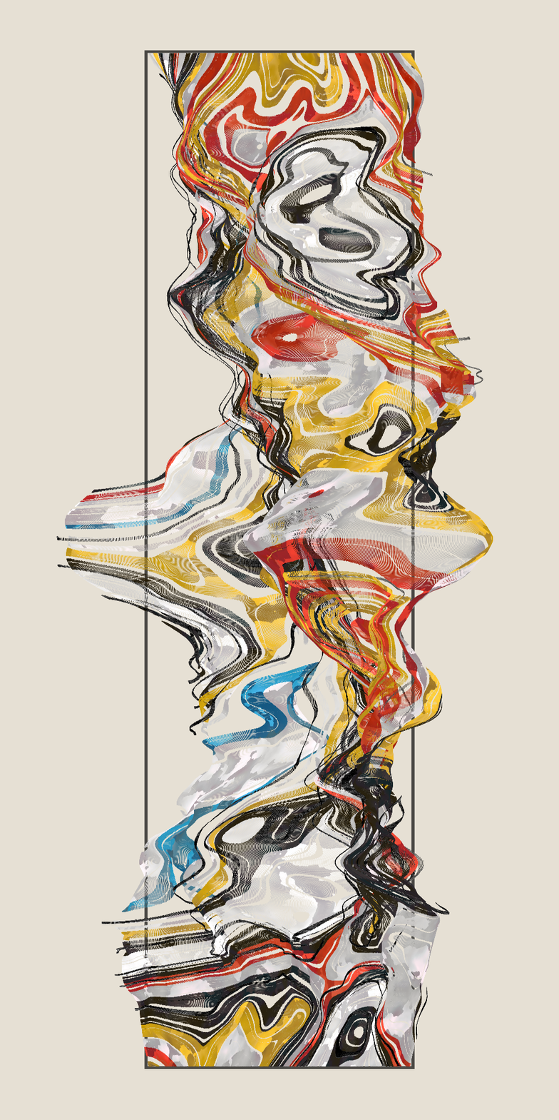
Immure is an attempt to create a work which represents something ancient, holy, and beyond our comprehension. Using elemental colors, it asks where these colors came from: are they natural, or did nature simply borrow them from its creator. How old can an entity be that may exist outside the bounds of our universe, and how many times has it altered the course of our world? Is this entity a doorway into the realm which created ours?
For a long time it's been a dream to create a generative system which feels like traditional art. Full of feeling and subtext, emotional texture, movement the likes of which a machine could never understand. This has been the first generative project I've worked on which has scratched that itch. I owe a lot of that to the creator of chroma.js (gka on github), a brilliantly simple, light, and useful color manipulation library which has been something I've dreamt of since I first worked with color in p5 *gags*. Shoutout Wouter Missler for suggesting it to me and Felix Diemling for bringing it to his attention with your use of it on 'Provence.'
The Basics
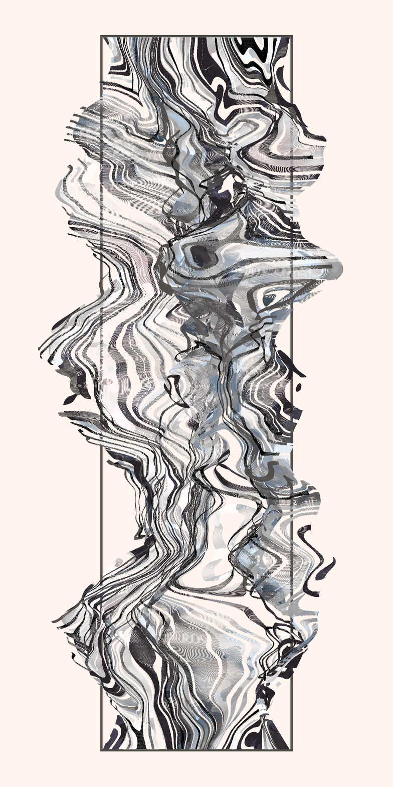
Immure began as simple experimentation. At its core is just a few layered noise fields, one for color, shape, saturation, luminance, and color temperature. The color field decides which of 40 colors from the palette to use (more on that later) and when it leaves that threshold (ex: 0.054-0.055) it moves to the next color in the array.
Shape is decided by a noise field which controls the z coordinate, and then the field is rotated between 20 and 40 degrees. I decided to work in an orthographic perspective to ensure the work looked square, which wouldn't limit perception of scale.
You can see pretty plainly in the image above that this is just a simple algorithm for a mountain range overlaid with another noise field to decide color. To break away from this, I kept the image vertical. In the end, the decision to switch to vertical proved useful, but more on that as we go.
Next, like all of my work, I wanted to add some margin so the image would not stretch to the edge of the screen. Instead of using a custom shape to create a margin, I adjusted the frustums of the orthographic projection to allow for space on either side, and a little on top.
The Frame
In a happy accident, I meant to add a proper margin with thin rectangles, and had not realized what ortho would do to it, that's where we end up with this frame structure suddenly in all my compositions. The top and sides of the frame are different weights because of the ortho skew, but I'll fix this later on.
From here, I think the effect of the noise field popping over and under the frame could look cool, but I'll need to fix the clipping, and that would require running a check on every pixel that approached z0 and remapping it to bend around, and this was already a heavy algo, so I'll table that for later (spoiler alert: I never got back to this as it was no longer necessary).
For now, let's just fix this frame so that the tops and bottoms of the field always start at z0 and then flow however they'd like. This looks a little like below, where yMod is multiplied against our final z value:
if(y < h*0.15) {
        yMod = map(y, 0, h*0.15, 0, 1)
      } else if(y > h*0.85) {
        yMod = map(y, h*0.85, h, 1, 0)
      } else {
        yMod = 1
      }

point(x, y, z*yMod)
From here there were quite a few hours of tweaking the noise scale thresholds for defining our shape and color density limitations, followed by tweaks to the final point being plotted. In the beginning, I used point(), and have swapped it out for sphere() while I work within WebGL, since WebGL struggles with any stroke drawings from p5.
I played with different aspect ratios at this point, as 1x2 was only a starting point, but came back around to it as the rest of the options felt lacking. This is also the session where I chose to thin down the frame, believing it helps add contrast to the form of the subject, but shouldn't distract the viewer.
Accents
Let's also add a random chance (say 10%) that a line become an accent line, so we get a bit more contrast, rendering in black or white, and skew its z value by some small margin. Though it shows left to right (like an x value), it will be more dynamic on the z axis. We can split the chances evenly between black and white vs leaving the palette color.
accentDecider = fxrand()
accMod = randomInt(-play, play)
accModB = randomInt(-play, play)
if(accentDecider < 0.05) {
          if(accentDecider < 0.025) {
            fill('white')
            stroke('white')
          }
          z = z+accMod
        } else if(accentDecider > 0.95) {
          if(accentDecider > 0.975) {
            fill('black')
            stroke('black')
          }
          z = z+accModB
        }
Color
Now, the biggest thing to tackle in this project: I want this to have painterly color. Let's start with using a library to more efficiently manipulate color, chroma.js.
I first began by creating an extended palette, one of the original colors, one darker by one shade, one lighter, one warmer, and one cooler. Even on my simplest palettes of 5 colors, this leaves us with 35 colors with some range, ensuring already that even if you reroll the same palette, you can get vastly different results.
From there, we get into color texture. I mentioned above that there are noise fields guiding luminance, saturation, and color temperature, and thats exactly what I did next. Before plotting each point, it checks the noise value of x, y against all color modification fields and adds them all together in a one function for sat and lum, then a separate color temperature modifier. This is the value we feed to the draw function so there is variation of color temperature, luminance, and saturation as we move around the canvas. This can create neat pockets of color, add shape and texture to the overall form, and most importantly it feels more natural, mimicking paint.
This needs some tuning of the ranges in which it can saturate etc, but we're looking so much more natural here, and you can see the lower luminance areas appear as shadows, and higher luminance and saturation are highlights.
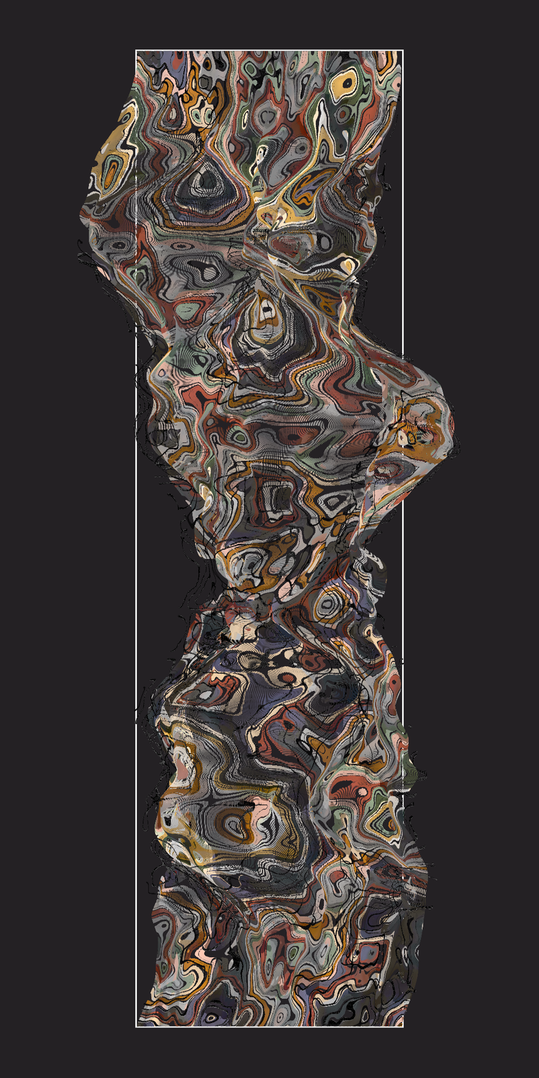
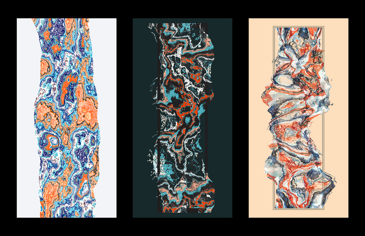
Up until now I've been reusing palettes from KINJO! and Aliciidae just to test functionality, but since we now know how the color behaves, let's build a few palettes. I can't get into all 19 of them here but the new additions do deserve some spotlight:
O'Keefe
My favorite of the new additions, taking inspiration from Georgia O'Keefe's Leaf Motif No. 2, this palette sticks to earth tones, with a warm shadow and a cool highlight pair for green, yellow, and red. Then assigning 'whites' and 'blacks' (our brightest and darkest colors to really form the composition) for the palette with complimentary tones, in this case a deep dull navy blue and a warm cream. All of these colors would not readily pop against saturated backgrounds but when they're paired with a clean solid color they're extremely beautiful to me.
project name project name project name
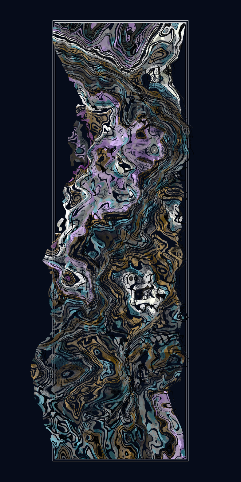
Oil Paint
Similar to my thoughts on O'Keefe, I wanted a palette that felt deep and rich, while playing with nontraditional hues, like an out of tune piano. Looking at abstract oil paintings was my best run at this. Skewing hues of a balanced palette towards green and magenta.
project name project name project name
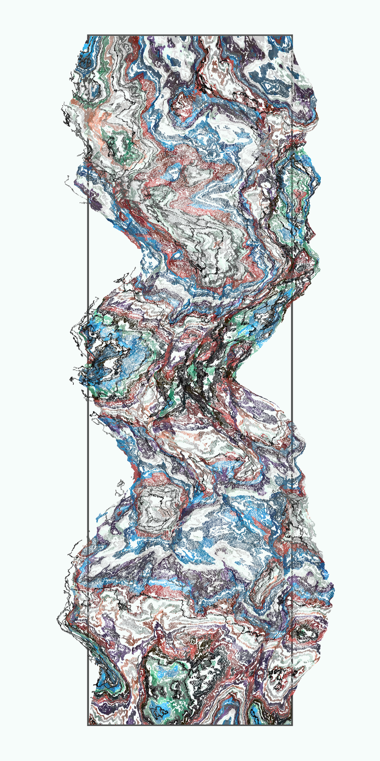
Sea Foam
This is a palette lent to me from the talented Wouter Missler (WootScoot) while working on color. I loved the gorgeous array of teals and rich aqua blues, this was a great addition in an abstract elemental series!
project name project name project name
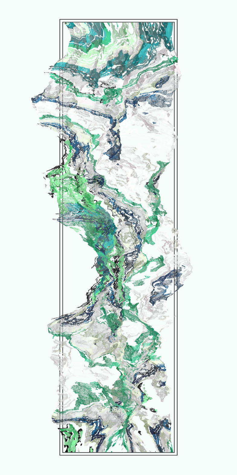
Ceramic
I created this palette based on the glaze of a pottery set in a store window. I'm amazed how much these colors can pop while maintaining this organic feeling, far from digital.
project name project name project name
Liquids
For the last of the aesthetic work, I wanted to keep a chance to change the noise octave from the standard 20, so there is a 5% chance your immure will appear liquid. The octave is simply randomized between 3 and 5.
project name project name project name
project name project name project name
Optimizing
Lastly, I want to briefly cover the optimization of the piece, as it is extremely heavy without the use of shaders.
This piece renders on a 1000x2000 canvas, using that same grid for the noise field, totaling 2,000,000 pixels to draw. The most efficient build for this is to map our values in the beginning, where all placement and color noise fields are saved to an array. While running, the drawing is split into 300 layers, which chooses slices of the noise field to draw each frame. This looks a bit like:
//while checking through all coords
//layers split from 1.25 instead of 1 is simply a way to ensure there aren't too many gaps, since each threshold is chosen randomly, they will sometimes overlap

N = //our color field
lim = //a random value between 0 and 1
threshold = 1.25/numLayers

if(N < lim && N > lim+threshold) {
//lets draw here
}
I want to thank you all for the love on the collection, as this was a labor of love and I've been greatly enjoying the art this algorithm can create :)