How to shatter the Obelisk? Part 1
written by Oleg Abakshonok
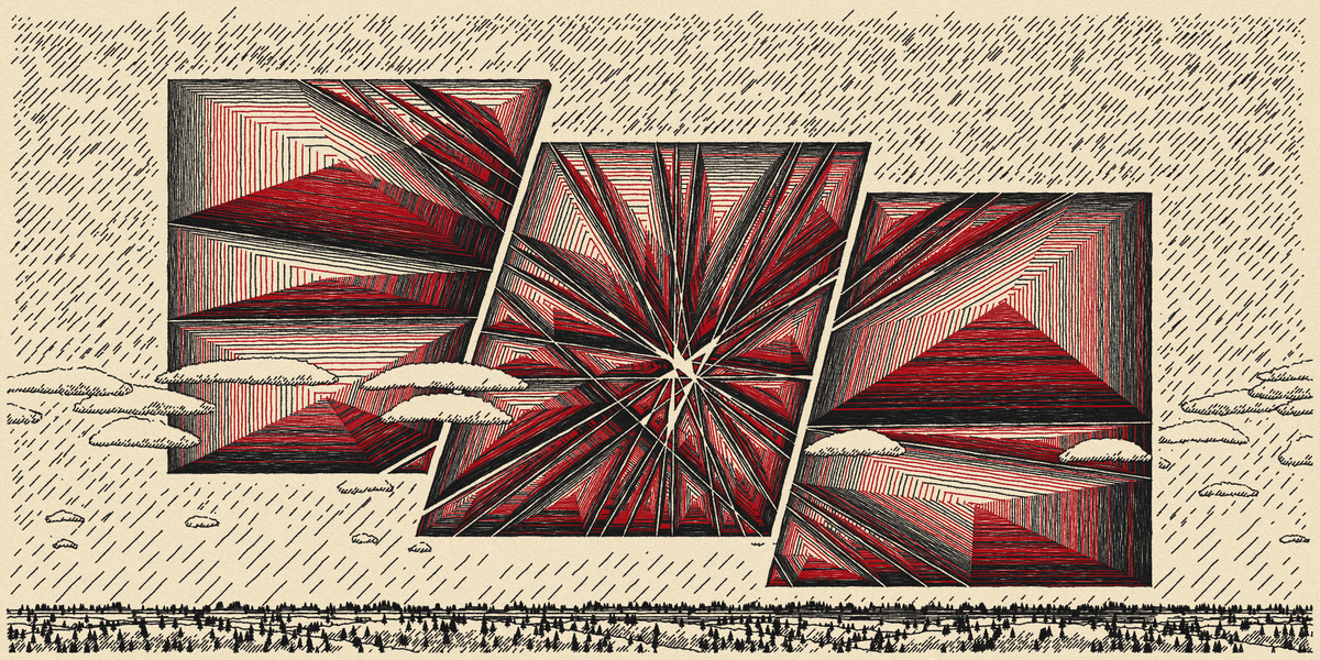
In this article I'll describe the process of developing my drop on Fxhash, Shattered Obelisks, and deconstruct its main functional parts.
I will tell you how I:
- Formed the idea for this artwork (Chapter 1)
- Made a cheap in terms of resources and very realistic paper texture (Chapter 2)
- Made an imitations of a ballpoint pen and liner, the complexity of which is not dependent on the number of lines (Chapter 3)
I also wanted to describe my approach to making realistic strokes that look like handwritten ones, but decided to leave that to a separate article because I want to improve the mechanics.
Before we begin, I recommend you take a look at the drop, if you haven't already seen it, and read its description.
Also, I apologize in advance for any incorrect word usage or mistakes. English is not my first language and I used an online translator. I would be grateful for any feedback on any inaccuracies found.
[0] = "Let me introduce myself"
Hi, I'm Oleg. Engineer in the past, then 3D designer. In parallel with my work I've been programming for many years for the needs of my main jobs. Now I'm already one year as an enthusiast immersed in generative art.
[1] = "Digging to the roots"
Before we begin, let me tell you how the idea for this artwork was born.
It all started with my habit of mindlessly scribbling on paper when I'm deep in thought, stressed, or suppressed. I don't think I'm alone in this habit, and I'm sure I wasn't the only one who had more reasons to do that over the last few years.
I wanted to embody this habit in code. To convey the carelessness and spontaneity of lines and the tendency of a drawing to grow out of random strokes, gradually turning into something meaningful and formalized.
[2] = "The roots are made of paper"
In my opinion, when imitating a paper drawing, you have to start with the paper. If you try to make the texture of the paper underneath an already finished pen, you will 100% have to rework the pen.
The wips above show the first iteration of the paper. In my opinion, it looks more like a primed cotton canvas. So after developing it, I reworked everything from scratch and will show you the final version.
The texture contains an imitation of light falling from "above". I realized that even if I succeeded in creating a realistic paper without it, it wouldn't be "alive".
The final effect is made up of three buffers filled with noise with values from -1 to 1. In the first buffer, I cut off the negative values. In the second one I cut off the positive values. The third one contains color information and larger noise to give color heterogeneity to the final texture.
Below you can see all three noises in a row. The scale is increased 30 times for better clarity. The heterogeneity factor of the color noise is also enlarged to make it visually distinguishable.
Well, yes, I understand that your first question is "What the actuall something is happening here?" Yeah, indeed, it's not very obvious, because they are combined using a number of overlay modes, so here's a more illustrative collage "in action".
The whole magic is that the noise in the shadow layer is slightly shifted down relative to the noise in the peaks layer. You can check this on the previous picture. Because of this, if you subtract the shadows from the peaks, you get an image where below each "peak" there is its "shadow".
The complexity of the implementation is not in the advanced algorithms, but in the fine-tuning and multiple reconfiguration of the parameters. I tried to avoid "magic numbers", which influence the code without explaining what this influence is for, but it's hard to remove them completely.
Let's move on to the code, shall we? It looks scary, but I swear I tried to make it at least interesting.
	noisePeaks.loadPixels();
	noiseShadows.loadPixels();
	noiseOlds.loadPixels();
	noisePen.loadPixels();
	noiseAroundPen.loadPixels();

	for (let i = 0; i < width; i++) {
	    for (let j = 0; j < height; j++) {
	        let noiseDensity, currentNoiseRandom, noisePeaksCurSet, noiseShadowsCurSet, noiseOldsCurSet;

	        noiseDensity = 0.3;
	        currentNoiseRandom = random2(-0.1, 0.1);

	        // Yeah... I understand, it's a little complicated to dive into it, but i just want you to show main principle
	        noisePeaksCurSet = color(
	                              // I'll explain what happens below it in reversed order:
	                              //
	                              // - Abs receiving noise seed in a range (-1...1) and gives range (1...0...1) in result;
	                              //
	                              // - Constrain used for flattening the peak values.
	                              //   E.g array [1, 2,...7, 8, 9, 10] with constraints (1, 8) will become
	                              //   [1, 2,...7, 8, 8, 8], which could be called flattening of peaak walues
	                              //
	                              // - Map extrapolates modified noise range into color range (0...255), but in specified
	                              //   subrange... I mean, (120...210) is a color range :)
	                              map(
	                                constrain(
	                                  abs(
	                                    currentNoiseRandom + noise(i * noiseDensity, j * noiseDensity)
	                                    ),
	                                  0.1, 1),
	                                -1, 1, 210, 120)
	                              );

	        // All code that happens below is a variations of what I described above,
	        // so I will only draw attention to the key points.
	        noiseShadowsCurSet = color(
	                               map(
	                                 constrain(
	                                   abs(
	                                     // "0.2 + j * noiseDensity" to shift the noise downwards relative to peaks noise
	                                     currentNoiseRandom + noise(i * noiseDensity, 0.2 + j * noiseDensity)
	                                     ),
	                                   0.1, 0.7),
	                                 0, 1, 30, 0)
	                               );

	        noiseOldsCurSet = color(255,
	                            map(
	                              constrain(
	                                // "* 0.2" to scale noise 5 times relative to peaks/shadows noise
	                                currentNoiseRandom + noise(i * noiseDensity * 0.2, j * noiseDensity * 0.2),
	                                -0.5, 0.5),
	                              -0.5, 0.5, 119, 120)
	                            )

	        noisePeaks.set(i, j, noisePeaksCurSet);
	        noiseShadows.set(i, j, noiseShadowsCurSet);
	        noiseOlds.set(i, j, noiseOldsCurSet);

	        noiseAroundPen.set(i, j, color(0,
	                                     // NoiseShadowsCurSet.levels[0] is grayscale part of color created above
	                                     // and has a range of (0...30).
	                                     // The map extrapolates it into the range (0...1), using as the initial
	                                     // range (25...0), that is, values from 25 to 30 will always result in 0
	                                     // in the new range. This is needed to increase the number of values which close to 0.

	                                     // Round, afterwards, leaves only 0 and 1. We end up with binary noise,
	                                     // mostly black, and black pixels are located where the shadows are darker,
	                                     // that is, in the recesses of the paper.
	                                     // The constrain is used as an extra check, just in case.
	                                   constrain(
	                                     round(
	                                       map(noiseShadowsCurSet.levels[0], 25, 0, 1, 0)
	                                       ) * 255,
	                                     0, 255)
	                                   )
	                           );

	        noisePen.set(i, j, color(0,
	                             map(
	                               constrain(
	                                 abs(
	                                   noise(i * noiseDensity, noiseDensity / 3 + j * noiseDensity)
	                                   ),
	                                 0, 0.25),
	                               0, 0.25, 20, 0)
	                             )
	                     );
	        }
	    }

	noisePeaks.updatePixels();
	noiseShadows.updatePixels();
	noiseOlds.updatePixels();
	noisePen.updatePixels();
	noiseAroundPen.updatePixels();
Generating noise for the whole canvas is extremely expensive in terms of resources, because only the CPU is involved. Moreover, it also makes no sense, because the uniqueness of such fine details is indistinguishable. That is why I decided to take advantage of texture tiling.
However, I was afraid that if I just repeat the texture with identical tiles, the pattern could get very noticeable. My first thought was to mirror the tiles vertically and horizontally. The problem is that my texture has a strict light direction, so this option wouldn't work.
In the end I decided to offset the texture of the tile in a checkerboard pattern by a random value vertically, from 25% to 75%.
I find the code of the tiling system not very interesting and obvious, so I will not overload the article. I think everyone can easily find their own way to implement it.
[3] = "Ink flows in the paper roots"
I mean... this is where I talk about pen lines :D
I will describe the principle that I have decided to rely on in my imitation. I call it the principle of sufficient realism. Its essence: the goal of realistic imitation is not to replicate reality in every detail, but to sufficiently convey a sense of realism to the viewer. The idea is to find the key elements that distinguish the line, drawn by pen, from any other. This allows us to find the best solution between performance and realism.
Since my drop is focused on plotters - the number of lines in an iteration varies with the size of the window and the scale of the browser. This allows me to generate a rendering for both A5 and A1 prints.
Because of this, I couldn't simulate the handwriting of each individual line - that would take an absolutely unpredictable amount of time. So I settled on drawing all the lines of a certain type (ballpoint / liner / pencil) on one buffer and post-processing that buffer. Pencil variations did not end up being included in the release.
The links to both iterations: first one - Shattered Obelisks #27, second one - Shattered Obelisks #100
[3][0] = "Inconstancy of the Stroke"
Still, a small part of the stylization is already integrated into the drawing of the line in the initial buffer. Creating a realistic stroke from a line will be described in next article, but for now I will just briefly say that for each line I create a gradient object, and its start and end points coincide with those of the line.
The gradient is filled with a lot of color keys. The amount depends directly on the length of the line. This effect is much more noticeable for the ballpoint pen than for the ruler. The imitation conveys the variability of the amount of ink hitting the paper.
[3][1] = "Shadow of the Ink"
A very important part of imitation is the flattening of the paper by pen pressing! And believe me, it has a huge impact on the realism and "integration" of the drawing into the paper. I mean, Im trying to convince myself of that, because I've spent a lot of time adjusting it.
Like all the code that will be mentioned in this chapter, the implementation consists mainly of finely tuned blending modes through which the initial buffer with lines is passed.
	let shadowTint = color(0, 40 + paperThickness * 30);
	let blinkTint  = color(0, 40 + paperThickness * 30);

	// Drawing a shadow in the imprint buffer. paperThickness defines offset strength,
	// because the pen goes "deeper" into the thick paper
	paperDepthGraph.tint(shadowTint)
	               .image(penGraph, -paperThickness * 0.75, -paperThickness * 1.5)
	               .image(penGraph, -paperThickness * 0.75, -paperThickness * 0.75)
	               .filter(BLUR, 0.5)
	               // Next INVERT has explanations for this one
	               .filter(INVERT);

	paperDepthGraph.tint(blinkTint)
	               .image(penGraph,  paperThickness,       paperThickness * 2.5)
	               .image(penGraph,  paperThickness * 1.2, paperThickness * 1.2)
	               .image(penGraph, -paperThickness,       paperThickness * 1.2);

                       // The point of two inversions is, filter inverts ALL drawing operations before it,
                       // so im inverting shadow, and then, with second INVERT im AGAIN inverting shadow and,
                       // this time, blink too it results in non-inverted shadow and inverted blink.
	paperDepthGraph.filter(INVERT)
	               .filter(BLUR, 0.5)
	               .noTint();

                       // After drawing I weaken the colour below the initial line so that it blends in more weakly
                       // with the further drawing of the line over the shadow.
	paperDepthGraph.blendMode(REMOVE)
	               .tint(0, 127)
	               .image(penGraph, 0, 0);

        // I also weaken the texture of the paper below the initial line to simulate pressure flattening.
	blendMode(REMOVE)
	if (penStyle.value === 'liner') {
	        // Liner flattens the paper more weakly than a ballpoint pen.
		tint(0, 110);
	}
	if (penStyle.value === 'ball') {
		tint(0, 180);
	}
	image(penGraph, 0, 0);

	canvasObject.drawingContext.globalCompositeOperation = "luminosity"
	tint(0, 50);
	image(penGraph, 0, 0);
	canvasObject.drawingContext.globalCompositeOperation = "saturation"
	tint(0, 255);
	image(paperDepthGraph, 0, 0);

	noTint();
	blendMode(BLEND)
	image(paperDepthGraph, 0, 0);
Short description: I move one copy of the buffer just above and to the left and use it to darken the imprint buffer. I move the second copy of the buffer lower and to the right and use it to lighten it. The result is a shadow/light pair that mimics the dent response to the light source above.
I apologise to all dark theme users😅
[3][2] = "The Ink itself"
The code for each type of pen is noticeably different, so I will show the liner as the most comprehensive and imitating the greatest amount of nuances of realism.
	penGraphBackup.image(penGraph, 0, 0);

	lumaCorrectionGraph.image(penGraph, 0, 0)

	                   // Invert operation for making the lightest parts the darkest, to balance them out when overlapping each other.
	                   .filter(INVERT);

	// "luminosity", "color" and "source-atop" are blending modes of vanilla JS and could be found on:
	// https://developer.mozilla.org/en-US/docs/Web/API/CanvasRenderingContext2D/globalCompositeOperation
	penGraph.tint(255, 105)
	        .drawingContext.globalCompositeOperation = "luminosity"
	        .image(lumaCorrectionGraph, 0, 0);

	// Using the luma-balanced graph for color balancing.
	colorCorrectionGraph.image(penGraph, 0, 0);
	penGraph.tint(255, 127)
	        .drawingContext.globalCompositeOperation = "color"
	        .image(colorCorrectionGraph, 0, 0);

	// The previous two operations affect the anti-aliasing of the lines, making their edges
	// rougher and more detached from the background, so I restore the pixel opacity of the balanced
	// layer with the original pixel opacity of the penGraph
	penGraph.tint(255, 255)
	        .drawingContext.globalCompositeOperation = "source-atop"
	        .image(penGraphBackup, 0, 0);
So... you still remember that I tried to make the code interesting, right? :D
Anyway, firstly I flatten the accumulation of color in places where the pen is self-crossing. I don't intend to remove it completely, just smooth it out. In reality, it is very subtle for the liner. For the ballpoint pen it is a little stronger, but also within certain limits.
	noiseAroundOffset = penStrokeWeight * 0.20;

	allDrawingGraph.blendMode(MULTIPLY)
	               .image(penGraph, -noiseAroundOffset, -noiseAroundOffset, 0, 0)
	               .image(penGraph, -noiseAroundOffset, noiseAroundOffset, 0, 0)
	               .image(penGraph, noiseAroundOffset, -noiseAroundOffset, 0, 0)
	               .image(penGraph, noiseAroundOffset, noiseAroundOffset, 0, 0)

	               // This blend mode substracts existing pixels opacity with new pixels opacity.
	               .blendMode(REMOVE)

	               // Pixel-scale binary opacity noise (0% or 100%) based on "paper shades" texture layer.
	               // Means, it'll exist only over shades of paper texture.
	               .image(noiseAroundPenGraph, 0, 0)

	               // Removing the part beneath initial lines themself, for preventing unwanted overlays.
	               .image(penGraph, 0, 0);

	// No need in full copy of pen opacity, because it's just a tiny leak of ink.
	tint(255, 150);

	// This operation needed for replacement pen imprint from [3][1] chapter with ink leak pixels.
	// Replacement only occurs in those pixels where the new layer has a colour.
	cnv.drawingContext.globalCompositeOperation = "source-over"
	image(allDrawingGraph, 0, 0);

	// Also adding this leaks on penGraph. It's just works better like this :D
	penGraph.tint(255, 150)
		.image(allDrawingGraph, 0, 0);
Then I make a layer with the ink dripping away from the line. To do this, I move copies of the initial buffer to all 4 sides, and then, in subtraction mode of the alpha channel, overlay them with a layer of fine noise, made on the basis of the "shadows" layer at the paper. This fine noise consists only of pixels with an opacity of 0% or 100%. The more 100% pixels, the smaller the amount of drips will be. What will I end up with? A layer with spots of " drips" placed only where the paper has a indentation. It's a small detail, but it increases the integration of the line into the paper for free, so why not.
	blendMode(BURN);
	tint(255, 255);
	image(penGraph, 0, 0);

	canvasObject.drawingContext.globalCompositeOperation = "color"
	image(penGraph, 0, 0);
I will summarize this first part. I tried to describe the basic mechanics in detail and in the most understandable (at least I hope) language. Developers very often bypass them or pay too little attention. At least, when I was developing this artwork, I managed to find very little information on these topics.
Well, I hope I succeeded and was able to answer some questions or give some valuable ideas.
Bye😘