Examining The Petri Dish
written by Macintosh
On Tuesday 13th September (13th Humm, should have spotted that) I hit 1500 followers on Twitter in the late afternoon. I’d been working on a celebration of 1500 followers over the previous week for when (if?) I hit that number as my following had been slowly growing since I started publishing generative art.
I wrestled with a few ideas – maybe it could contain 1500 abstract figures, sort of like a miiverse. Or it could be a generative PFP, or it could be something growing. I also wanted it to be unlike my normal ‘stuff’.
I wanted it to be a celebration of the platform too, with a nod to all the wonderful work and some popular styles. This made me want to do one of three things, a flow field, a landscape or noise-generated abstract patterns. I went with the latter which immediately felt like cells growing in a petri dish, as a metaphor for growing followers and my growth as a generative artist. Concept nailed!!!
project name project name project name
To the internet – how the hell do I do noise projects – luckily there are LOTS of tutorials and examples. Within a couple of hours, I had something on the screen.
The first output below, yep looks like something growing in a dish, albeit somewhat abstract.
Right, then I went crazy, creating different renders on top of the noise map, I was focusing on 3 values inside the map to draw ‘top layer’ graphics and the whole map for the ‘background’. So each edition features a colour set of 3 colours to render the image – though those are ‘seed’ colours and many variations are used.
The background map used either pure maths or my core colour pallet to represent the numbers in the noise map and fill the screen. Not all versions have a background (40% do in the settings).
Then over the top was a spikey pattern, dots, microdots making little characters, blobs, bloom (a sort of coloured area around the core pattern element), gridlines, confetti and …. blades. Any or all of these ‘layers’ maybe present creating new effects from the combination.
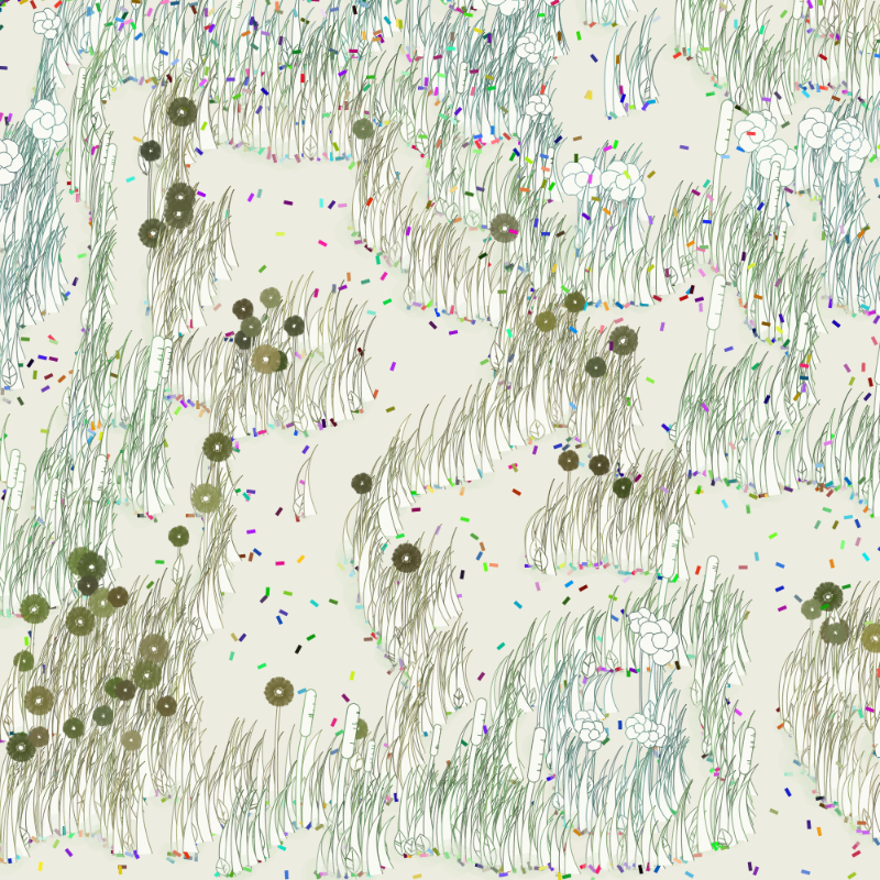
I was really enjoying the noise patterns, some really felt ‘alive’ in a bacterial sense. So I was thinking how can I make it more ‘growth’ literal, should I have furry tendrils coming off the edge of patterns? This led me to think of taking it less petri dish real and more ‘fx(fun)’ how about I turn it into a ‘nature/landscape’ sketch? So the three colours became three plant types, a petal plant, a reed and a dense coloured flower. Each had blades of glass-like growth and leaves. These immediately felt like incredible fun.
Each element is generative based on some simple vector drawing code that has elements randomised and reused from some of my existing library of functions for drawing lines and non-perfect shapes. The shifts in colour and shape create an organic feel which still clearly uses stark line art graphics.
It felt like a real celebration of many elements of incredible fx(hash) works that had gone before but were unique and stood up.
The plan was always to have a 1500 edition piece, so for that to work for me, it would have to be very, very cheap or free. Plus it would need a lot of variety, so 9 named features and 6 colour pallets (+ a randomised one and inverted). This created a project that really needed a large run. Also, with such varying styles of output, being free means you can mint several until you find one you like.
Before this, I’ve only ever minted out a ‘paid for’ project of 64 editions, and that normally takes hours/days (with one exception ‘Dazicker 50/50’ sold in 3 mins).
So I finished work and published it at 18:07 and went and made/ate dinner. BOOM it blew up. I know people like free – I’d done a free post a couple of weeks ago that went quickly but that was 128 editions and for a reserve list of owners of previous projects.
It also started to sell on the secondary market at a healthy rate, still at tiny prices but it's my art in the hands of people that like and want it, so that’s a celebration alright. It was such a buzz to see my work in the sales feed on discord!
Nobody expects....
Then at 20:04 this message on Discord…
After a few messages and samples were sent over my stomach felt sick, there was something wrong. But it’s really odd, it's only rendering elements of the work. Big thanks to Qfwfq, patakk, charliesurf.tez and more who really supported and helped me identify the problem on discord. Patakk worked out it was only a problem on retina and 4K displays – which I don’t have! Luckily I had my work laptop which is an m1 MacBook – so I could test on there and the problem replicated. Initially, I thought it was just adding ‘pixelDensity(1)’ which partially fixed It but there were still major issues. next up... 4.5 hours of debugging.
There is literally no way I would have discovered it was a screen density issue without the community so thanks to you all.
Eventually, it came down to the offscreen noise map I was using just seem borked no matter how I set the density, it had glitches in the map when I displayed it and wasn’t creating the outputs the algorithm needed – so it wasn’t drawing much of anything.
So time for a refactor – there’s actually no need for the map to be a graphic so I turned it into a 2d array of values. This fixed it but with a lot of tweaking, it generates slightly different outputs, not radically different but not quite the same, which is fine. I actually actively tweaked some of the pallets and features slightly.
I made the decision to upload the new version as a free mint with reserves for all the owners of the original. I kept adding anyone that bought one up to the time it went live.
project name project name project name
So there we have it the highs and lows of a celebratory free drop. Everyone in the community has been super supportive and helpful. It left me feeling a bit sick and down – but it's done now and best to move on positively.
Also if you have one that won't render on your monitor, let me know and I can send you an 8000x8000 png of your #. BTW both will download 8000x8000 pngs on pressing H in live view. I forgot to put it in the notes for the original.
People seem to love the ‘flower’ version – it's called ‘blades’ in the code, and ‘nature: hallowed’ as a feature – fallow, when absent.
But I really love many of the other variants – and it's always pleasing to see some of these being picked up on secondary as they are just as interesting. But I may revisit the line art nature again in the future.