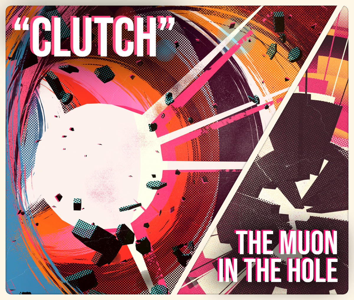
Double feature : "Clutch" & "The muon in the hole"
written by Christophe "Ulu...
Pitch
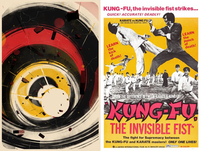
It seems all my fx(hash) projects have to do with pop culture and "Clutch" is no different. This one is about exploitation/grindhouse type movies of the 70's/80's, specifically action / crime movies, their posters and their music.
I wouldn't call myself a specialist at all, but I've seen my fair share of niche movies of all kind due to early VCR access and a lot of late-night TV in my teens. I enjoy a good action sequence, cheesy dialogues and the occasional clunkiness.
I wanted to express action, speed and groove, but also the sleaze and the cheese. I wanted people to hear a groovy bass line and the wah-wah pedal in action.
"Clutch" is the generic protagonist of a movie in that space. Not much is known about Clutch, only that he's/she's/they're badass, sexy and dangerous.
The concept didn't solidify until halfway through development though. It started as a continuation on my work on POW! with halftone patterns. I just released The Summoning at the time, with which I struggled quite a bit on questions of scalability and animation, so I wanted to do something way simpler this time, and more abstract because I like to alternate.
The main design goals at the start were :
- Scalability of the outputs : The outputs should scale infinitely without quality loss.
- Low numbers : low color count, low number of "moving parts", keep it simple.
- Hot colors, high contrast.
- No opacity shenanigans : every element should only display fully opaque or fully transparent.
- Distress : elements of the composition should feel used or broken.
All those rules have been lightly broken as the project evolved, but they still define the look of the piece, raw and dynamic.
The project is thought as existing at poster size, or at least the size of a decent desktop computer screen. It lives best in "live" mode.
The Muon in the hole follows largely the same creative impulse. It was made as an interlude in "Clutch" for #fxhashturnsone and uses a very similar theming and structure, with a sci-fi twist. It's also generally way less saturated, but noisier to compensate. This removes most of the violence from the theme.
Direction
Like in my previous projects, I work in 3D even if the final result is intended to look fully 2D. I also work with real-time performances in mind, meaning the project should render fast ( < 0.1s ). This mainly allows me to iterate at breakneck speed and test things easily. I also never know entirely if I'll include animations or not in a project, so that's always an option.
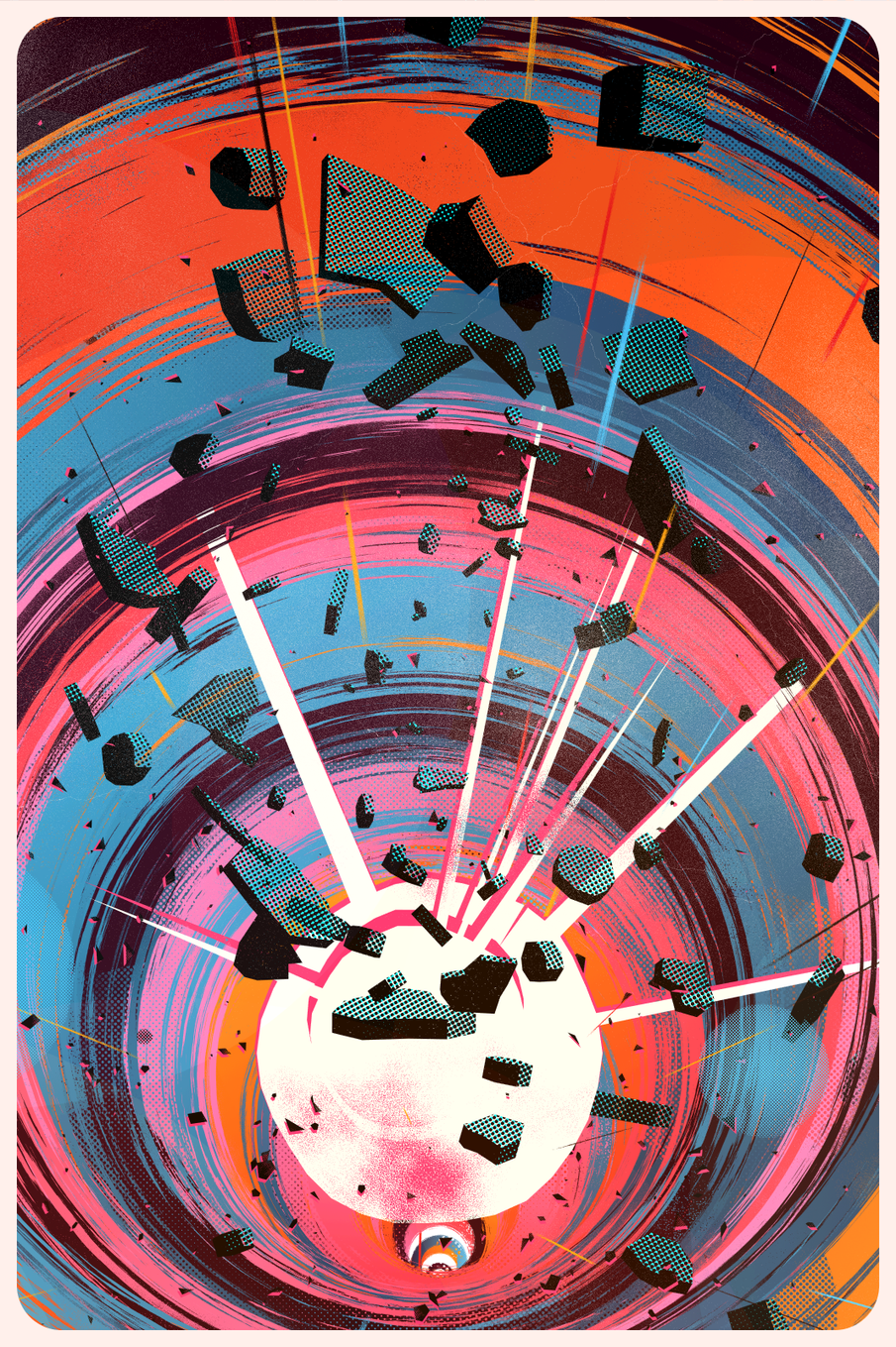
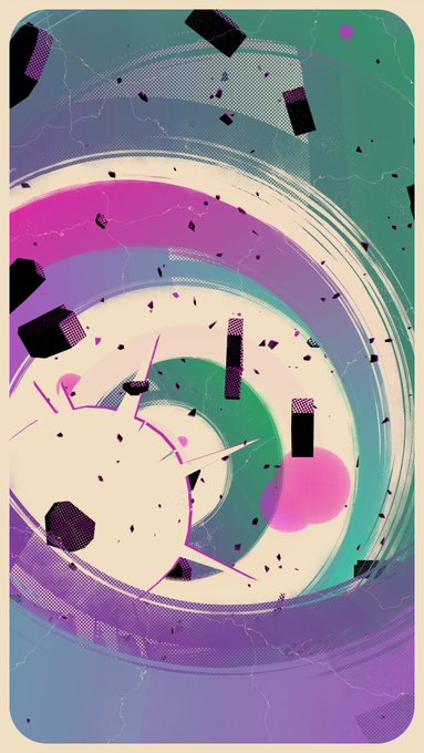
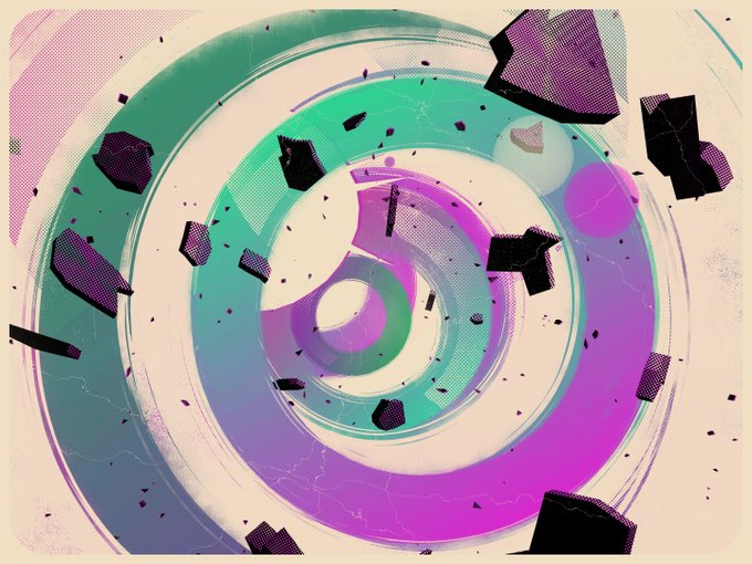
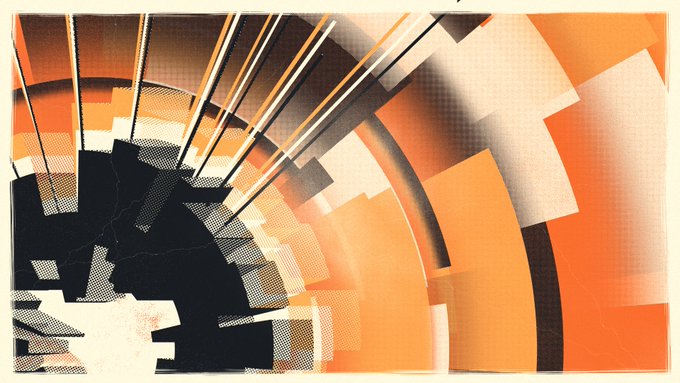
"Clutch" is composed of :
1. Background
A flat color. This color is reused in other elements of the composition.
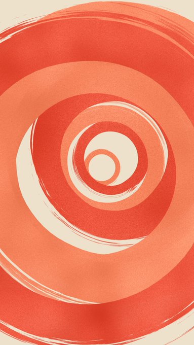
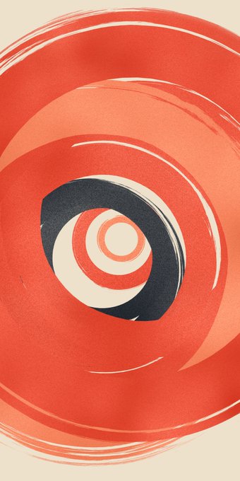
2. Color rings
Between 20 and 100 rings are generated per seed. These are slightly deformed circles, with inner and outer brush-like distress. Various types of holes are punched in the shape, some with regular patterns, some irregular. Each ring can also contains an inner circle shape.
The rings are scaled and distributed along a more or less noisy path from the back to the front.
3. Fragments
500 small polygons are generated and scattered semi-uniformely across the space. They come with a square based pattern rather than circle, and the intensity of the halftones is from another general pattern. A "shadow" is also generated, painted in a contrasting color. The idea of slightly colored shadows behind dark elements is present throughout both "Clutch" and "The muon in the hole" and is one of the core graphic features of both projects.
4. Explosion
The main focus, although it is sometimes hidden. Another deformed circle, this time with some spikes along the perimeter, inward and outward. It also comes with its shadow. Both layers have their own distress methods, the front part being finer while the shadow holes are rougher.
Some seeds generate a second explosion.
5. Dashes
Some rays are generated and sprinkled radially from the explosion, but not really aligned, just generally in the same direction. They're distressed similarly to the color rings.
6. Rocks
The only 3D shapes of the composition, you get between 20 and 150 of those. They too use the concept of dark front / color shadow, but yet in another way. The intensity of the pattern depends on an arbitrary "lighting", and the color shadow is the same pattern with an offset, inscribed in the same shape.
7.& 8. More circular shapes
More slightly deformed circle come in play to add some accidents. One group contains a few big and very faint circles painted additively on top of the rest, the other are a few randomly placed circles with yet another halftone pattern variant. Those are opaque and contrast with the ones made of holes in the rings.
9. Overlay & frame
On top of it all, I overlay some more dusty noise, usually pretty sparsely, but some seeds are more intense. I also draw some wavy lines, meant to evoke poster creases or simply cracks in the poster.
The frame is finally drawn. It's the only element that's not deformed or broken in any way, just a rounded rectangle. I like this little bit of contrast and the rounded corners feel thematic to me.
Mise-en-scène
The general construction algorithm is as follows :
- Choose two points in the frame, one in the back, one in the front.
- Between these two points, define a wavy 3d curve.
- Along that curve, distribute rings and rocks.
- Somewhere toward the back of the curve, add the explosion(s).
- Sprinkle the fragments and some circles towards the foreground.
- Add some dashes pointing towards the back of the curve.
- Paint the overlay and the frame on top
Of course, everything is randomized in some way or another, mostly in terms of varying ranges. The only binary parameter is the aspect ratio of the seed, which influence the rest of the parameters. Aside from that, the palette is a also discrete value, chosen at generation.
Color
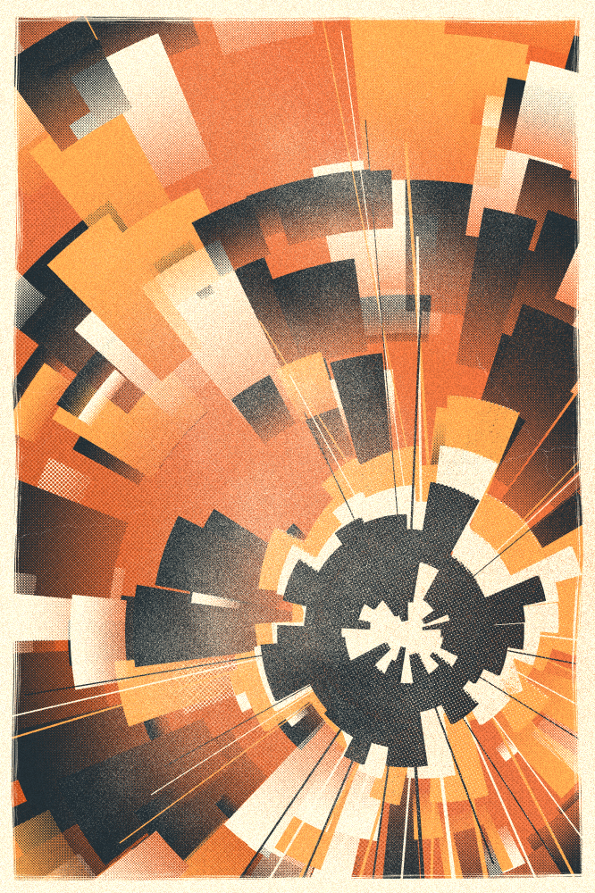
Each seed get a random palette from a list of 13. All palettes except one are directly inspired by movie posters.
Each palette contains the definition for a few colors, like the background, the rocks shadows or the color of the frame. They also contain a collection of colors for the rings. At generation, this list of colors or randomly weighted according to the seed, which allows each palette to express itself in various ways. Nearly all palettes include the background color as an option for the rings, to create some fake negative space. They also generally include a darker color to create the ink feel, that is treated separately as to not overpower the colors.
The palettes also define rules for gradients. Gradients are present in most palettes, but are usually a very small change in saturation or luminance. A few palettes use a hue shift, which was a feature that was an error at first and became a happy accident.
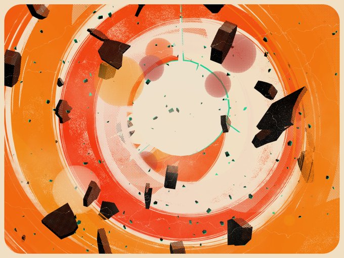
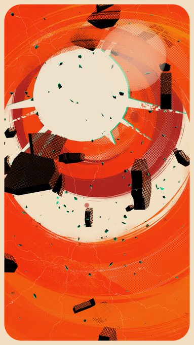
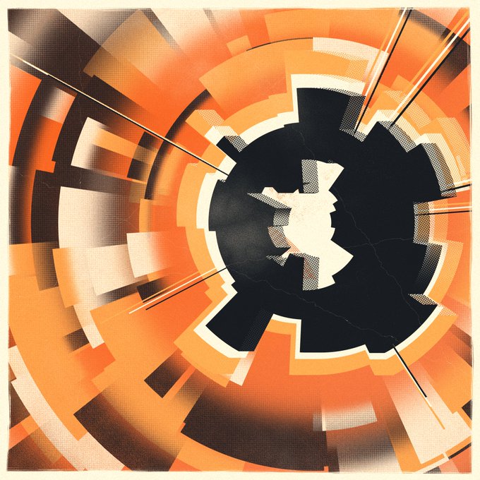
Interlude : The muon in the hole
"The muon in the hole" is largely similar, but simpler. The frame is now a distressed rectangle, the noisy overlay is more intense. The rings are replaced by rings arcs of varying size, and the explosion is replaced by a generated 3d shape, plus 2 "shadows" of this shape.
Being an interlude project, I did some recycling to save time. For the central shape, I reused a space station a I did for "Visa to the Stars" with barely any modifications, just an expanded parameter space, that I drew the same way as the rocks in "Clutch".
Behind the scene
From a technical standpoint, it's all pretty straight forward, and similar to some of my previous projects :
- Define some general shape with 3D meshes, mostly planes
- Do the heavy-lifting in the shaders
If you don't know what meshes or shaders are, you can think of it as a wall, with a ton of weirdly shapes frames hung on it with paintings in them. The frames are the meshes, the paintings in them are the shaders.
The use of an orthographic camera allows me to treat the whole thing as 2d. Elements are created aligned towards the camera and the lack of perspective in the projection means that changing the depth of an object does not change its position in the render.
All the meshes are pretty simple. Deformed circles, deformed circles with spikes, extruded deformed low-res circles, etc. and rectangles (frame, overlay, dashes).
The shader work consists mostly of punching holes in the shapes. Usually each shader will mix different types of halftone patterns, varying the scale, the size, but also the reference : some patterns use the meshes texture coordinates, some use the meshes vertices world positions, other the vertices coordinates on the screen. Using these various approaches produces the fun effect that happens when you translate the camera, but it's also one of the things I wanted to experimented with at the start of the project.
The shader for the rings is the most complex one. Its algorithm is roughly :
- Define the zone to distress with the "stroke" effect from the inner and outer radii and the UVs. Remove the alpha from the value of stretched polar gradient noise in that zone.
- Define a fine Worley noise , mask it with a low frequency gradient noise, and threshold the value to remove some small noisy circles from the alpha.
- Define a large circle shape in UV space and use it define haltfones patterns that scale with world coordinates. Also removed from the alpha channel.
- For the color, apply the gradient rules defined by the palette, linearly along the UVs.
The shader used for the rocks in "Clutch" and for the big structure in "The muon in the hole" uses the dot product of the normal and the "light" (just a vector really) to determine the size of its halftone pattern, whose negative is used to again subtract to the alpha channel.
A very important aspect of the final look is the crucial use of super-sampling anti-aliasing. At typical browser resolution, the resolution is too low to display enough detail of the various patterns, and this approach gives me the best results. This is costly operation and you can see I chose to only do it when the scene is static. It's disabled when the camera is moving or when I have to redraw the UI. For performance reasons (and power saving), the rendering is done on a per-need basis, and is disabled by default, the artwork being static.
Bonus feature : User Interface
I decided to implemented some UI for this project. I'm not really sure why, but it's a space where I like to have a bit of fun.
The seed creates its unique frame for the menu, a randomly deformed rectangle, as well as a few animations frames, also randomized.
The title itself is coded and is actually 3D extrude. The shape is static though.
I added a dynamic tagline under the title, for the theme. The seed determines a base tagline, as well as a random gender, to keep it mysterious. Enthusiastic use of capitalization, ellipsis and exclamation marks. Many are adapted from actual movie taglines.
The whole menu is placed under the same overlay, same as the rest of the piece. It sometimes interacts nicely, but sometimes also hampers the readability. I found it interesting enough that it stayed. Probably not the best idea, it would be way more user-friendly to do these things in a classic HTML/CSS <div> on top on the main canvas. But that would mean probably loading some static assets, which I'm not opposed to, but try not to do.
Sequel bait
A couple random thoughts to close :
- Looking back at my fx(hash) production over the year, I realize I'm not using the classic generative algorithms very much, focusing mostly on composition and colors. Maybe I should work on that in the future.
- I'm also making too much explosions and I should refrain. There are other ways to add a dynamic surely.
- Current main idea for the next experiments is a continuation of "Clutch", in theme and techniques, but in a very NOT abstract fashion.
- Excited for fx(params) but I'll have to wait and see exactly what it entails before designing for it.
- No "features" for this. They seem to often be misused or misunderstood. I don't design those with rarity in mind, only as filters to help curation, and only a third-party website allows to filter a collection by features for now.
- Very happy people seemed to like "The muon in the hole". Thank you all again.
Update 08/18/23 : The generators
I just realized that you can edit fx(text), so I'm linking the generators :