Est tempora vero facere est placeat tempore quos. Consequatur nam deserunt sint nulla magni recusandae ab autem. Voluptas sed incidunt harum necessitatibus porro enim illo. Ab quam commodi veritatis. Dolor iure esse unde sint. Facere reprehenderit nostrum illo temporibus voluptatibus. Vero sapiente sint culpa. Cum rerum aut et. Minima suscipit animi hic molestias blanditiis repellendus. Impedit vel est dolor autem et molestias assumenda iste. Nobis laboriosam doloribus iusto omnis eum sunt. Ratione ut omnis consequatur minus. Sapiente eum id dolor modi aut voluptatem eligendi. Voluptatibus sint nihil quibusdam quod accusamus et. Perferendis impedit debitis minima culpa sit omnis fuga. Rerum voluptatem est sit. Iusto pariatur qui doloribus et asperiores. Ex sed ullam perferendis nostrum. Aut quas adipisci sed consequatur explicabo ut.
Aut quas adipisci sed
Est tempora vero facere est placeat tempore quos. Consequatur nam deserunt sint nulla magni recusandae ab autem. Voluptas sed incidunt harum necessitatibus porro enim illo. Ab quam commodi veritatis. Dolor iure esse unde sint. Facere reprehenderit nostrum illo temporibus voluptatibus. Vero sapiente sint culpa. Cum rerum aut et.
suscipit animi hic molestias blanditiis repellendus. Impedit vel est dolor autem et molestias assumenda iste. Nobis laboriosam doloribus iusto omnis eum sunt. Ratione ut omnis consequatur minus. Sapiente eum id dolor modi aut voluptatem eligendi. Voluptatibus sint nihil quibusdam quod accusamus et. Perferendis impedit debitis minima culpa sit omnis fuga. Rerum voluptatem est sit. Iusto pariatur qui doloribus et asperiores. Ex sed ullam perferendis nostrum. Aut quas adipisci sed consequatur explicabo ut.
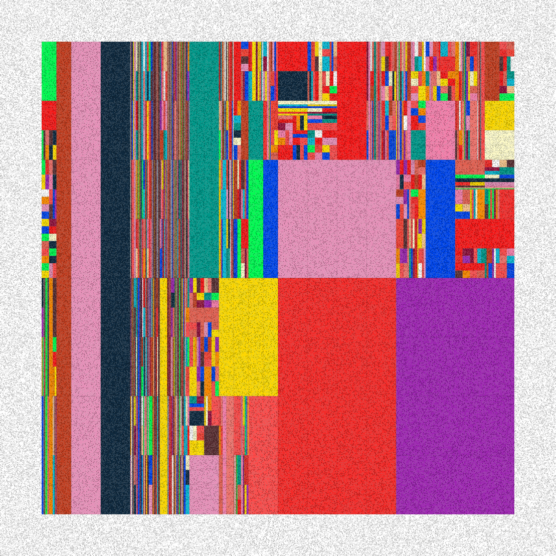
In this project, different nodes are simple orthogonal shapes of color spots and thin lines to demarcate colors. I tried to create a dynamic effect by questioning the usual signs of vision in the abstract works of this period, to modify the relationship between them profoundly, and to show another field of my understanding of this movement by drawing a personal space.
by username username
project name project name project name
The colors red, black, blue, and yellow were used from this turning point in the Neo-plasticism that the artists of the 'De Stijl movement cared about.
Subtle black lines separate the vast rectangles, which for some are filled with bright or black, or gray; each small component is a member to create a whole and a single visualization, and each aspect of the components receives its visual value from the whole.
A RANDOM PIECE OF De Stijl /the Style
This work has set 27 color palettes and three variations to shape different rarities. It is better to set the browser to standard mode to see the effect better.
A RANDOM PIECE OF De Stijl /the StyleA RANDOM PIECE OF De Stijl /the StyleA RANDOM PIECE OF De Stijl /the StyleA RANDOM PIECE OF De Stijl /the Style
De Stijl (The Style)
The style "De Stijl" of the Dutch avant-garde movement is an essential key to understanding the sources of the modern movement. The movement is organized around three central figures: the painter Piet Mondrian and Theo van Doesburg and the furniture designer and architect Gerrit Rietveld. Other core members are the painters Bart van der Leck, Georges Vantongerlo, and Willmus Huzar; the architects J.J.P Oud, Robert van Hoff, and Jan Wills; the poet Anthony Cook, later the graphic designer Piet Zwart and the architect Cornelis van Stern.
De Stijl 4th No 11 Dec 1921
In 1918, a year after the official founding of the group and publication of the magazine's first issue that published and publicized the movement's doctrine, the creators of De Stijl combined the aesthetic and social vision. The group's first manifesto calls for a new balance between the individual and the universal and fights to free art from the limitations of the cult of individualism.
THEO Van Doesburg /composition XII 1917-18
De Stijl originates both in the Hegelian tradition and in the Theosophical movement, then spreading in the Netherlands, both a utopian vision and a commitment to the production of the reality of the industrial world. However, it is a formal, plastic, pictorial, or architectural transcription of the principles of universal harmony that its creators implement.
PIET MONDRIAN 1872-1944
Painting, sculpture, furniture design, graphic design, architecture, and soon urban planning support this experiment, carried out simultaneously by different group creators. De Style productions naturally go beyond the traditional and academic division between primary and secondary arts, decorative arts, architecture, and urban planning.
Paintings by Vilmos Huszár 1884 Hungary – 1960 NetherlandsPaintings by Vilmos Huszár 1884 Hungary 1960 NetherlandsJACOBUS JOHANNES PIETER OUD 1890-1963 Holland [Netherlands]
From the realm of the mind to the city, this can be the guiding thread for the evolution of the Style's productions during its fourteen years of life. The spatial nature of the work of art gradually reaches from the status of supporting the analysis of the world to a factor in building the social and political environment of the city. In this way, the spatialization of the work forms an experience of the world, gives order to the world, and gives essence to society.
PIET ZWART drawing/ VILMOS HUZAR Color scheme Drawing for a Chair 1920 Ink on paper [Ink on paper] 51.3 x 34 cm[The Netherlands]PIET ZWART /Composition 1925-26 print on paper 19 x 12.1 cm [The Netherlands]
The Style's priority is to invent an official language that responds to the challenges of the industrial society after World War I and outlines strategies for implementing the new social order. The method of this vision is Neo-plasticism, which initially consists in radicalizing the approach of the contemporary avant-gardes.